Thursday, February 25, 2016

Just A Note Botanicals

Have you ever designed a card and then after it's done you can't decide if you like it or not? That's where I'm at with this card!

I started with the idea of placing the flowers from the Botanical Builder Framelits in a tea cup. I chose a lovely paper from the Birthday Bouquet DSP and die cut my tea cup as well as one from self adhesive fun foam. I stuck the two together. I inked up the cup and the edges of the fun foam with Soft Suede. I used Wink of Stella to give the cup a nice shimmer.

On the flip side of the DSP was a lovely coordinating pattern that I chose for the upper two-thirds of my card. I decided on Mossy Meadow for the bottom and I embossed the lower third of a 4 x 5 1/4" matte using the Woodgrain Embossing Folder. I then adhered the DSP to the top two-thirds and adhered a strip of the 3/8" Stitched Mossy Meadow Ribbon across the join. I adhered this piece to a Soft Suede card base using Dimensionals.

Picking colors from the cup for the flowers–Watermelon Wonder, Pool Party and Mint Macaron as well as Mossy Meadow and Old Olive for the greenery–I die cut them using the Botanical Builder Framelits.

I tried a few designs until I settled on the one that I used. After snapping a photo, I inked the edges of the flowers with their matching inks (except for the Pool Party one where I used Lost Lagoon) and both ferns with Mossy Meadow. I also used my McGill Paper Blossom Tool Kit to shape the flowers and ferns.

I adhered the cup to the card front using Fast Fuse Adhesive, sandwiching the darker fern in place beneath it. I then adhered the remaining flowers and greenery with a combination of Dimensionals, Fine Tip Glue Pen and Glue Dots. I added rhinestones to the flower centres.

Using Soft Suede, I stamped the sentiment from the Picture Perfect Stamp Set on Old Olive card stock. I used the Washi Label Punch on it and inked the edges with Mossy Meadow. I adhered it to the bottom of the card front using Dimensionals to complete the card.


I did not create an inner matte for the card yet because I still haven't decided if this card is a keeper! Can you help me decide by leaving me a comment below?


Monday, February 22, 2016

Balloon Congratulations For Global Design Project

I made the deadline for the Global Design Project #023 this time! It was a close call because I was having a bit of difficulty coming up with a balloon design. However, I persevered and finished my card!


My card colors also allow me to participate again in the Stampin' Royalty Challenge #317.


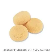
I started by punching large and small balloons from Watercolor Paper using the Balloon Bouquet Punch. I used Stampin' Sponges to color each with either Bermuda Bay, Cucumber Crush or Watermelon Wonder.

I grew a bit frustrated with designing a balloon bouquet because the balloons just didn't look right. Not until I came up with my current design did I think to do a Google search for balloon bouquet examples!

To make my design work, I referenced the four design principles that I had learned when I studied Multimedia Design:
  1. Contrast
  2. Repetition
  3. Alignment
  4. Proximity
To make these four principles easy to remember, we used the word CRAP. There is a really good downloadable poster that summarizes these points here.

For my card, I chose to use Contrast and Repetition. For the Repetition principle, I lined up two rows of alternating colors of balloons to use as the focal point of my card. When I used a different color and varied the position of one of the balloons, I used the Contrast principle.

For my card base, I used Watermelon Wonder and chose a finished card size of 4 3/4 x 6". From a wavy Bermuda Bay design on one of the Shine On Specialty Designer Series Papers I cut a matte. I adhered the matte to the card front using Fast Fuse Adhesive.

Using a ruler, I lined up the first row of five balloons, overlapping each and alternating colors, across the card. The balloons were offset on the sides and top of the card; I adhered them with Fast Fuse Adhesive.

I adhered four of the balloons in the second row and then for the focal point balloon, I used a Watermelon Wonder balloon and popped it up on double Dimensionals for the top part of the balloon and a single for the bottom. I also moved the balloon slightly above the alignment of the row of balloons. Using a pair of scissors, I trimmed off the balloons where they overhung the card base.

Before adhering the Watermelon Wonder balloon, I tied a length of black twine, separated from one of the twines in the Baker's Twine Combo Pack, around the balloon. I took a small amount of Crystal Effects and ran it up and down the twine with my fingers and then I left it to dry. I then wound the twine tightly around a pencil to give it a corkscrew twirl.

Using one of the now retired Adorning Accents Edgelits dies, I cut scallop borders onto a strip of Watermelon Wonder card stock. I cut a strip of Bermuda Bay striped paper from the Shine On DSP and adhered it on top of the scalloped piece. Using Fast Fuse Adhesive, I adhered this strip over top of the end of the balloon string.

Using the handy reference for the Banner Triple Punch found on the Feeling Crafty With Bekka site, I cut a strip of Cucumber Crush card stock and flagged each end with the punch. I used my MISTI with Stazon ink to stamp the sentiment from the now retired Sky Is The Limit Stamp Set. Using my MISTI allowed me to stamp the sentiment three times for a nice black impression. I used a Stampin' Sponge with Cucumber Crush ink to ink the edges of the banner.

I adhered the banner with Dimensionals to the card stock strip on the card front.

To amp up the design of the card, I used my Clear Wink of Stella pen to generously glimmerize (I think I created a new word here!) the Watermelon Wonder balloon as well as adhere an assortment of coordinating sequins.


I think this card creates a colorful party atmosphere befitting any type of congratulatory occasion!

Hope you enjoyed learning a little bit about design and my card making process today. I'd love you to drop me a comment below!


Saturday, February 20, 2016

Timeless Textures Thank You

Those of you who know me well, or at least follow my blog, know that I love texture. Because of this, I was immediately drawn to this card by Dena Rekow.

Dena's card employs texture in a few ways:

  1. By using a patterned paper
  2. By stamping with ink with the Timeless Textures Stamp Set
  3. By stamping with water
Yes, you read that right! Stamping with water is a really neat technique that produces texture by subtracting color! But I'm getting ahead of myself.

I decided to CASE Dena's card but change up the colors and use it for thank you cards for my stamping group.

I started by cutting a standard card base from Basic Black. I cut a skinny Island Indigo matte and finally a matte from a piece of the Typeset DSP.

I used Island Indigo with the mottled edge stamp from Timeless Textures to stamp around the outside of the matte. I then used another of the stamps to stamp a couple of times with Basic Black Archival ink on the matte itself.

I cut a tag for the card from Whisper White by using a die from the Lots of Labels Framelits Dies. I used a sponge dauber to color the entire tag with Bermuda Bay ink and then covered it again using Island Indigo ink. Using the swirly stamp from Timeless Textures, I spritzed it 4-5 times with my Mini Mister (until water beaded on the stamp). I then stamped it onto the paper and held it there for about 10 seconds.

What was left was a very light swirl stamp that deepened as it dried. I stamped it a second time and then made sure it was totally dry by zapping it with my Heat Tool. I then stamped the sentiment from the Crazy About You Stamp Set using Basic Black Archival ink.

I adhered the stamped matte to the Island Indigo matte using Snail Adhesive. A length of the 3/8" Basic Black Stitched Ribbon was knotted around the matte. This was then adhered with Dimensionals to the Basic Black card front.

The edges of the tag were inked with Basic Black Archival ink and then it was adhered with Dimensionals to the card front.

A matte of Whisper White was cut for the inside. (This is where I made an error but it was too late to correct. I should have used a Very Vanilla matte for the inside because the Typeset Paper has a Very Vanilla background rather than one that is white.) I inked the edges with the same stamp as on the front of the card and stamped one swirl stamp. The matte was adhered with Fast Fuse Adhesive to complete the card.


What is important to note about this card technique is that Clear Mount stamps were used. I'm not sure if Photopolymer stamps would work as well for this technique. In addition the stamps were "distressed" stamps so that weird effects from the water would be acceptable.

I will definitely use this technique again and I will try it with Photopolymer stamps to see if my hypothesis is valid. I'm thinking that the Awesomely Artistic Stamp Set might be a good one to try. The First Sight Stamp Set would also be another possibility. Even Kinda Eclectic could produce some neat results! It will be fun to experiment to see what works best!

I hope you try the water stamping technique–let me know how it works for you!


Fancy Fold Botanicals For Stampin' Royalty

>>>>>Update<<<<<

My card was chosen as a Top Pick on Stampin' Royalty #317! Click on the picture below to come and and play!


There is nothing like playing with a new technique to get your creative juices flowing! For awhile now, I have been wanting to try the Drapery Fold so tonight I put it to the test!

I decided to work with the colors from the Stampin' Royalty Challenge #317 because not only did they coincide with the colors in the Shine On Specialty Designer Series Paper I wanted to use but they happened to be some of the intense colors that I enjoy!

#sr317

To begin with, I checked out the video tutorial by Song Of My Heart Stampers. Once I knew what to do, I chose a piece of the Shine On paper that had Cucumber Crush ferns printed on the Kraft with silver V's on the opposite side.

I trimmed one side of the paper to 11 1/2" and then cut a strip that was 11 1/2 x 4". I scored the paper at 3, 4, 6, 7, 9 and 10 inches. I used my Stampin' Trimmer to cut from the 3" score line at an angle to about 1 1/2" from the top right corner of the strip. (In the video tutorial, she used a pair of scissors but I knew I couldn't cut that straight freehand!)

I accordion-folded the paper on the score lines and then used Fast Fuse Adhesive to secure the pleats in place. This pleated matte fit almost exactly across a 5 1/2 x 4 1/4" card base. I knotted a piece of Watermelon Wonder 1" Dotted Lace Trim around the top of the pleated matte.

I cut a card base from Bermuda Bay card stock and trimmed it slightly narrower than 5 1/2" in width to match the pleated matte. I used Stazon ink and my MISTI to stamp the sentiment from the Rose Wonder Stamp Set in the bottom right corner of the card front. Once the ink had dried, I used Dimensionals to adhere the pleated matte to the card front.

I stamped the veins of the two leaves using Cucumber Crush on Cucumber Crush card stock. I then used the Botanicals Builder Framelits to die cut flowers and leaves. I punched centres for the smallest flowers using the 1/8" Circle Punch. I played with my arrangement and took pictures to allow me to choose the best design.

Before adhering my arrangement, I used my McGill Paper Blossom Tool Kit to give some dimension to the die cuts and then used a sponge dauber to ink the edges of each flower and leaf with the coordinating ink. Once the ink was dry, I gave each a coat of Wink of Stella for a touch of glimmer.
The die cuts were adhered to the card front using a combination of Dimensionals, glue dots, and the Fine Tip Glue Pen. I added silver sequins from the now retired Frosted Sequins and also rhinestones to the largest flowers.

One last design detail was to wrap some of the now retired Silver Cording Trim around the knotted ribbon to provide a visual triangle between the silver of the underside of the pleats, the silver sequins in the flowers and the silver cord. For a good explanation of visual triangle design, check this blog post by Traci Reed. She applies the principle to her scrapbook pages but it can also be used in card making.

Here's the visual triangle on my card:

Linda Vich Creates: Fancy Fold Card For Stampin' Royalty. Shimmery botanical blooms grace the front of this card that showcases the drapery fold technique.
Visual triangle that uses the color silver
For the inside of the card, I chose a Very Vanilla matte and used the Botanical Blooms Stamp Set to stamp tiny flowers across the bottom of the matte. I inked the edges with a sponge dauber and Watermelon Wonder and then adhered the matte with Fast Fuse Adhesive to complete the card.


Close up details showing the Wink of Stella glimmer on the flowers


This drapery fold technique was a lot of fun to try and I will definitely be using it again soon!

Have you tried a drapery fold on one of your cards yet? Give it a go and then link to it in the comments below–I'd love to take a look!


Thursday, February 18, 2016

I'm Lost Without You

I finally got my hands on the Going Global Stamp Set! Once I got a good look at the various stamps, I envisioned a star-studded night sky artfully created with the use of printed vellum, Wink of Stella, and rhinestones.

Time to bling it up!

I started by cutting a Night of Navy standard card base as well as a strip that was about 1 x 5 1/2" in length. Also cut was a strip of Silver Foil 1 x 5 1/2" and a piece of vellum from the Botanical Gardens Designer Vellum Stack cut to just short of 4 1/4 x 5 1/2".

The now retired Adorning Accents Edgelits were used to trim the strips of card stock and foil. (To view another card that uses these, see Sale-a-Bration Freebie Sneak Peek.)

Using my MISTI, I stamped the sentiment on the die cut card stock using Versamark and heat embossed it using the Silver Stampin' Emboss Powder. I stamped the Big Dipper onto the vellum and also embossed it.

I adhered the vellum to the card base by putting little dots of Multi Medium Matte beneath the printed stars (where it wouldn't be seen) as well as along the base of the vellum. I adhered the die cut pieces of card stock and foil along the bottom of the card using Fast Fuse Adhesive.

Rhinestones were adhered to the stars in the Big Dipper. In addition, I used the Fine Tip Glue Pen to put little drops of glue on several of the vellum stars and then poured Dazzling Diamonds Glitter over top, knocking off the excess. One last bit of glitz–I added Wink of Stella to some of the stars that didn't receive any of the Dazzling Diamonds.

For the inside of the card I cut a matte from Whisper White. I used Night of Navy ink on my MISTI to stamp a portion of the compass stamp in the bottom right corner after stamping off twice. I finished the matte by inking the edges with a sponge dauber. It was adhered using Fast Fuse Adhesive.


Nice and blingy, huh? Remember, when in doubt, add glitter! And rhinestones. And Wink of Stella!

True to the title and card sentiment, I'm lost without you . . . my readers.

Your comments mean so much to me and encourage me to try new ideas and techniques to share with you! Thank you for taking the time to connect with me by leaving a comment below.


Wednesday, February 17, 2016

Too Late For Global Design Project #22

Sometimes, even if you have a design in mind for a card, you lack the time to bring that design to life. Such was the case with my idea for the Global Design Project #22!

The idea had been ripening in my mind after seeing the challenge sketch for GBD #22. However, I was unable to bring my design to life until today . . . two days late for the challenge :(


But that's ok. I wanted to make the card anyway to see if my design idea would work. I was pleased with the result!

My design was very, very simple . . . much different to my usual cards in both design and color!

Before creating my card, I tried out the stamps that I wanted to use on a scrap piece of Whisper White. I used the twine-like circle stamp from Project Life: Memories in the Making as well as the sentiment from Party Wishes.

I stamped the sentiment first by coloring the stamp with my new Gold Wink of Stella. I was amazed at how well it worked! After it dried (very quickly, I might add) I stamped the circle over it, using Versamark, and heat embossed it with Gold Stampin' Emboss Powder.

It looked just like I had hoped it would look!

I decided to use a card size of 4 3/4 x 6" because the standard size was just a little too small. I cut the card base from Thick Whisper White and also a matte that was just a hair smaller at 4 5/8 x 5 7/8". I also cut a sheet of Vellum Card Stock the same size as the matte.

Using a die from the Circles Collection Framelits Dies, I positioned both the stamps and the die on the bottom right of the vellum matte. My idea was to cut out a circular portion of the vellum to reveal the stamps on the matte below. Once I had my placement, I sent the vellum through my Big Shot.

Next step was to emboss the vellum using the Softly Falling Embossing Folder. Because the vellum was thinner than normal card stock, I knew it would emboss easily but I didn't want it to crack so I ran it through the Big Shot on the Multipurpose Platform with no Tabs.

The results were perfect!

I arranged the vellum and matte on my MISTI and positioned my sentiment stamp, colored it with the Gold Wink of Stella, and stamped! As soon as it was dry I positioned and stamped the circle with Versamark and embossed with Gold Embossing Powder, just like in my test run.

Wonderful results!

To adhere the vellum to the matte, a placed a few dots of Multi Medium Matte behind the embossed dots as well as along the top of the matte itself. I pressed and held it in place until it was set.

I cut a very thin strip of Gold Glimmer paper and glued it over the top of the vellum. My final step was to adhere the matte to the card front using Dimensionals.

Done!


Like I said, a very simple card yet I think it is very effective! This could be used for a birthday card or some other sentimental occasion. 

Drop me a comment below and tell me what you've been working on lately–I'd love to hear from you!


Friday, February 12, 2016

Final Valentine Projects

I'm finally finished! Made some treat baskets and a card for Courtney and Steffan and that's it for 2016 Valentines!

The Valentine treat baskets were very easy to assemble. I used the Berry Basket Bigz L Die with various colors of card stock and then embellished each basket by cutting four , 2 1/2" squares of patterned paper, folding each over a side of the basket. They were easily adhered with glue dots.

I made shredded paper for each basket by using my Fringe Scissors to cut strips of card stock and then crinkled the resulting pieces–so easy to make coordinated baskets this way!

Each basket had a few heart embellishments and a ribbon-tied Gusseted Cellophane Bag filled with Hershey's Kisses.

For Steffan's basket, I used Basic Black card stock with a striped patterned paper from the Neutrals Backgrounds DSP Stack. Shredded paper was white. Hearts were cut from both red and black Glimmer paper using the Hearts Collection Framelits Dies.


Courtney's basket was Garden Green and decorated with paper from the Love Blossoms DSP Stack. Rose Red shredded paper and Glimmer paper hearts–Blushing Bride and Dazzling Diamonds sponged with Rose Red– as well as Blushing Bride Sequin Trim and a Watermelon Wonder flower from the In Color Blossom Accents.


Finally, Raine's basket was made with Melon Mambo card stock and patterned paper from the Have A Cuppa DSP Stack. Bermuda Bay shredded paper was used to match the patterned paper and the hearts were all cut from Dazzling Diamonds paper and sponged with Melon Mambo and Bermuda Bay inks. A Melon Mambo 3/8" Stitched Ribbon tied in a double bow was the final embellishment.


The card that I made for Courtney and Steffan was a direct case from the card by Dawn Griffith and uses the Beautiful Ride Stamp Set. Her card was so perfect, I didn't want to change a thing! It was a fun technique to use and I can see myself using this for other cards in the future. I'll let you view Dawn's excellent video tutorial rather than repeat the directions for the card here.


I hope you enjoyed viewing my Valentine's Day projects. Hope you enjoy your February 14!


Thursday, February 11, 2016

Distress Ink Valentine

Today I set out to create a Valentine card for my husband. I had planned to case a card by Amy Rysavy. It was simply gorgeous and I thought I could recreate the watercolor look by using the Stampin Up reinkers.

I set out with the colors I had chosen–Coastal Cabana, Bermuda Bay, and Island Indigo–but the colors just didn't blend the right way. I tried again by watercoloring by putting distress inks on my craft mat and adding water but the colors weren't nearly as intense and I didn't have any reinkers for my distress inks.

So, that left sponging the background. I could have sponged with the Stampin Up inks but the distress inks blend so well so I went with them.

I cut a matte from watercolor paper and started sponging. In the end, I used 10 different distress inks to create my panel! I used Peacock Feathers, Cracked Pistachio, Mermaid Lagoon, Pine Needles, Blueprint Sketch, Faded Jeans, Chipped Sapphire, Evergreen Bough, Lucky Clover and Black Soot. And how do I remember what I used? I snapped a photo of course! It's a great way to record what you are using as you use it. I also used a sponge dauber to apply a fine line of Basic Black Archival Ink to the edges of the matte.

Inks used to distress the matte for the card front
After creating my background, I die cut the Queen of Hearts die from Memory Box using Silver Glimmer Paper. Because the design is so delicate and intricate, I used a metal shim with my Magnetic Platform as well as placing a dryer sheet beneath the glimmer paper.

What a beautiful die cut! It looked stunning placed on the distress ink background. It was then that I decided to add some Silver Cording Trim, wrapped around the bottom of the matte. I adhered the matte to a very thin Whisper White matte, using Fast Fuse Adhesive.

For the sentiment, I simply used the XOXO stamp from the Bloomin' Love Stamp Set. I stamped in Versamark on Basic Black card stock and embossed with White Stampin' Emboss Powder. I used the Bitty Banners Framelits to die cut the sentiment and then cut off the one end. Using the Confetti Hearts Border Punch, I punched a few tiny hearts from the Silver Glimmer Paper and glued them on the banner. I used Fast Fuse Adhesive to adhere the sentiment under the Silver Cording Trim.

I then attached the distressed matte and Whisper White matte to an Island Indigo card base using foam tape. I like to use foam tape when I watercolor because I think it holds the paper better, with less warping.

To attach the die cut, I decided to use spray adhesive. I placed the die cut face down in a box I use as my spray booth and coated it with the spray. Definitely easier than using the Fine Tip Glue Pen! However, it didn't adhere in all places so I ended up adding some Multi Medium Matte to finish the job. I adhered a sprinkling of sequins to complete the front of the card.

I cut a Whisper White matte for the inside of the card and stamped the large intricate heart from the Bloomin' Love Stamp Set. using Basic Black Archival Ink. I zapped it with my heat gun to be sure it was dry before beginning to sponge once again.

I only used a few inks this time–Blueprint Sketch, Pine Needles, Evergreen Bough, Peacock Feathers and Chipped Sapphire. It wasn't the best blending job ever but it still looked nice! I adhered the matte with Fast Fuse Adhesive to complete the card.

Completed inner matte with distress inks that were used


I think my husband will like the card. What do you think? Leave me a comment below–I'd love to hear from you!


Stampin' Royalty and Botanicals

>>>>>Update<<<<<

My card was chosen as a Top Pick on Stampin' Royalty #316! Woohoo! Click on the picture below to come and play!


Today I was busy making Valentine stuff which I'll post later this week. Just before picking up Raine, I had surfed over to the Stampin' Royalty blog and was surprised to discover that my Sky Is The Limit Birthday card was one of the picks for the #315 Challenge! That gave me a nice boost so I took a look at the challenge for this week and after supper I was compelled to create a card for it!

As soon as I saw the inspiration photo for the challenge, I thought of Mint Macaron and vellum. I knew that I would use the Botanical Gardens Designer Vellum Stack and lots of gold!

I started by selecting a piece of the vellum that had the flowers from the Botanicals Builder Framelits printed on the vellum. I used the Framelits to die cut some flowers from Mint Macaron and set about placing the die cuts on the vellum to form a pleasing cluster. Once I was happy with it, I added die cut centres from Gold Glimmer Paper and leaves from Gold Foil Paper.

I cut a card base from the Mint Macaron card stock to make a 4.75 x 6" card. I cut the vellum to fit the front of the card. I decided to tie a length of both the Mint Macaron Dotted Ribbon and Gold Sequin Trim down the l ft side of the card. This allowed me to use Snail Adhesive to attach the vellum where the glue wouldn't be seen.

I then shaped each flower with my McGill Paper Blossom Tool Kit set and inked the edges of each with Mint Macaron ink. I glued each centre into its flower using Multi Medium Matte. Before gluing the flowers onto the vellum, I made a thread nest from Gold Metallic Thread and secured it under the edge of the ribbon using a glue dot.

The flowers and leaves were then glued into place. The smallest flowers were adhered with glue dots. A rhinestone, coloured with a Copic marker, was added to each little flower.

The sentiment, from the Picture Perfect Stamp Set was stamped with Tip Top Taupe onto Mint Macaron. Then the sentiment was re-stamped using Gold Encore ink (I used my MISTI, of course!) Using the Tip Top Taupe ink first help d to give the color a bit more depth.

The sentiment was die cut using a die from the Bitty Banners Framelits. The edges were inked with Mint Macaron and then the banner was glued to the card front to complete the card.


Close up details
It felt good to complete this card and have it look even better than I envisioned! I'll be entering this card in the Stampin Royalty Challenge #316.

#sr316

Hope you have a great day!

Tuesday, February 9, 2016

Punch Art Valentine

With Valentine's Day fast approaching, I sat down today to work on my personal Valentines. Of course, the first one I wanted to create was for my granddaughter, Raine.

I knew that I wanted to make a shaker card and I also knew that Minnie Mouse would be involved but I wasn't yet sure of the design.

In the last couple of days I had scoured Pinterest in search of Minnie Mouse punch art. I pinned a few but the best I found was at Sharon's Scrappy Space.

I grabbed a bunch of punches as well as Basic Black, Whisper White and Blushing Bride card stock and got ready to create. I started by punching shapes from scrap paper. Once I had settled on my design, I started punching the real stuff.

Here's the list of the punches I used to create Minnie Mouse:
  1. Head–2" Circle Punch
  2. Ears–1" Circle Punch
  3. Face–Large Oval Punch
  4. Cheeks and Snout–Small Oval Punch
  5. Whites of the Eyes–Large Oval Punch trimmed two times with the 1 1/4" Square Punch
  6. Eyes and Nose–1/2" Circle Punch
  7. Hands–Mitten Builder Punch trimmed with the 1 1/4" Scalloped Circle Punch
  8. Eyelashes–Word Window Punch trimmed with the 1" Circle Punch and scissors
  9. Arms–1/2" Basic Black strips
All parts of Minnie were adhered using Multipurpose Liquid Glue. Basic Black 1/2" strips were used for arms and The Dress Up Framelits Dies were used to cut a dress, which was later trimmed, from the Brights Backgrounds DSP Stack. A glue dot was used to adhere a Melon Mambo 1/4" Cotton Ribbon bow.

After assembling Minnie, it was evident that a 5 x 7" card was needed. I chose Basic Black for the card base. I cut a matte from Whisper White and used a strip of heart paper from the Have A Cuppa DSP Stack on the bottom of it. I chose to use Bermuda Bay card stock on the upper portion of the matte to match the designer paper.

I used the Happy Heart Embossing Folder to emboss the Bermuda Bay card stock and then sponged on some Bermuda Bay ink to bring out the texture of the raised image. I adhered both it and the designer paper to the matte using Fast Fuse.

Using Minnie and a heart die from the Hearts Collection Framelits to determine placement, I die cut a heart from the matte. In addition, I used two heart dies together to die cut a heart frame from Melon Mambo card stock. I embossed it using the Decorative Dots Embossing Folder.

I used my Fuse Tool and a square die from the Squares Collection Framelits to create shaker pocket. I inserted a piece of Melon Mambo card stock and an assortment of sequins. I used tape to adhere the pocket to the back of the die cut matte.

A length of Melon Mambo 3/8" Stitched Ribbon  was cut and it was laid across the seam made by the two papers. The ends were taped at the back of the matte and then scissors were used to cut the ribbon in half in front of the heart shaker. The excess ribbon was cut off and Tear & Tape was used to adhere the remaining ribbon pieces to the card front.

I adhered Minnie to the die cut heart frame and then used both liquid glue and Dimensionals to adhere them to the matte. The matte was adhered to the card front using Dimensionals.

The sentiment from the Bloomin' Love Stamp Set was stamped with Basic Black Archival ink on Bermuda Bay. It was die cut with the banner die from the Large Numbers Framelits Dies. The sentiment banner was adhered to the card front using Dimensionals to complete the card.

I'm pleased with how it turned out though I regret not sponging the heart frame. Oh well, I don't think Raine will notice!


Close up showing the sparkly sequin shaker mix

I hope you enjoyed reading about my process for this card. I'm off to create more Valentines!


Thursday, February 4, 2016

Life Is A Beautiful Ride For Global Design Project #021

Today I wanted to design a card for the Global Design Project because I really liked the colors. Or at least two of them . . . Wisteria Wonder is not one of my favorites because I find it is a kind of watered down color that can take on a real gray tone. However, I can happily play with Bermuda Bay and Melon Mambo!

The Have A Cuppa DSP Stack uses this color combination so I thought I would be able to use something from there to help me out.

I started by using my MISTI to stamp the Volkswagen, from the Beautiful Ride Stamp Set, using Basic Black Archival ink on a piece of watercolor paper. The MISTI allowed me to restamp to get a good black outline as it is often hard to get a good first stamp on watercolor paper. I then stamped it again using Versamark so that I could heat emboss it using Clear Stampin' Emboss Powder. I repeated this process for the stack of suitcases.

I used my Aqua Painter along with reinkers to paint the car and then used my Heat Tool to ensure it was completely dry. I cut out the car and suitcases using both scissors and my Fiskars Fingertip Craft Knife. This knife is a wonderful tool and it makes it easy to control because you actually wear it on your finger! I'm looking forward to receiving my order of the Fiskars Reverse-Action Fingertip Tweezers which are designed the same way.

I cut a Melon Mambo card base for a 5.5 x 5.5" card size. I chose a Bermuda Bay patterned paper from the Have A Cuppa DSP Stack and cut a matte to go on the card base. I adhered it with Fast Fuse Adhesive.

I chose a 4.5" square of Thick Whisper White for the front matte and cut a very thin Basic Black matte to go beneath it.

To work in a bit more color, I decided to "flick" paint droplets onto the white matte prior to attaching the car and suitcases. I used the reinkers again but made sure to use a paintbrush with lots of water on it so that the ink would fly off easily. After using the three colors for the card challenge, Bermuda Bay, Melon Mambo and Wisteria Wonder, I dried the matte with my heat tool.

I adhered the white matte to the black matte and then used Dimensionals to attach it to the patterned paper matte.

I cut a .75" strip of Basic Black and flagged one end using the Banner Triple Punch. I used my MISTI to stamp the sentiment using Versamark and then heat embossed it using White Stampin' Emboss Powder. I used Fast Fuse Adhesive to attach it to the matte.

The car was adhered above the sentiment banner using Dimensionals. I then cut a length of twine from the Baker's Twine Combo Pack and separated out the black strand. I used it to tie around the stack of suitcases, mimicking the lines that were on the stamp. I then adhered the suitcases above the car.

To complete the card, I used Copic markers to color three pearls and adhered them to the end of the sentiment banner.


I am entering this card in the Global Design Project #021.

#gdp021

Hope your "ride" is a good one today!


Wednesday, February 3, 2016

Sky Is The Limit Birthday

>>>>>Update<<<<<

My card was chosen as a Top Pick on Stampin' Royalty #315! Woohoo! Click on the picture below to come and play!


Wow! Have you ever had one of those crafting sessions where everything just goes together tickety-boo? I certainly had one of those days today!

I was actually working on a couple of different projects–coloring for a card challenge project and creating a new card.
When I started, I knew three things:
  1. color scheme–Kraft and Always Artichoke
  2. stamp sets–Sky Is The Limit and Timeless Textures
  3. layout–two mattes, one embossed; burlap trim
This was one of those cards that I got an inkling for and I mulled it over in my mind since last night. This morning, the idea really gelled so I could go ahead and create the card!

As I often do, I had the design software for my Silhouette open so I could draw out my idea and modify it as I worked on my card. I find this very useful because I can choose the exact size for mattes, etc. I even copy a picture of the stamp and put it into place to get an idea of how everything will fit together. It also cuts down on paper waste.

Linda Vich Creates: Sky Is The Limit Birthday. Timeless Textures gets a workout in this masculine card that showcases the Sky Is The Limit plane.
Card design in Silhouette Design Software
I cut a standard size card base from Kraft card stock and also cut a matte that was 3 x 4.25." I had a scrap piece of the Kraft which I used to test out the inks that I might use on it. I find that I waste less card stock this way. Also, ink looks different on different card stocks as well as looking different when it is dry compared to how it looks wet. I tried Baked Brown Sugar, Tip Top Taupe and Soft Suede. Soft Suede was the winner!

I opened the Timeless Textures stamp set and started by choosing the grid pattern stamp. The Timeless Textures stamp set was a no-brainer purchase for me! So many useful stamps that can be used and used for years to come! This Sale-A-Bration stamp set is only available FREE with a $60 purchase until February 15. If you haven't yet got it, put it at the top of your list–you won't regret it!

I chose the grid stamp and inked it up with the Soft Suede and stamped once at an angle on the left of the matte and then "dabbed" parts of it around the matte. Next, I used the kind of smudgy edge stamp and stamped it on the top and right edges of the matte. The coffee ring stamp was next. I stamped it off once and then stamped it once on the bottom and twice on the top. I used some of the grunge dots to sort of fill in the rest of the matte with texture. To give the whole matte some depth, I sponged deep edges and corners with the ink.
Basic Black ink was used to stamp both the plane and the sentiment.

I cut a small piece of the Burlap ribbon and then cut it in half lengthwise. I folded one of the pieces in half and cut the ends at an angle. I knew that I wanted to staple the burlap to the matte but I didn't want a silver staple but that's all that we have from Stampin Up. So, what to do? I used a E15 Copic marker to color the staples and then stapled the burlap to the matte. The staples now looked just like I wanted them to look!

For the Always Artichoke matte, I didn't want to use the texture stamps but it was looking a little bare. I looked through my embossing folders from Stampin Up but didn't have one that would give the look I was after. I decided to use my Cheetah Print embossing folder (which is part of a set of two embossing folders) because I thought it sort of resembled camouflage which kind of went with the grungy card I was creating.

After embossing the matte, I sponged the edges as well as the embossed pattern to give it a bit of life.
All that was left to do was put the card together! I used Dimensionals for both mattes, turning the stamped matte at an angle.


I am really liking this masculine card! The Sky Is The Limit stamp set will be one that I turn to often. To see other projects that use this stamp set, be sure to view The Sky Really Is The Limit! and Sale-a-Bration Freebie Sneak Peek.

I'm entering this card in the Stampin' Royalty Challenge #SR315. The theme is Cards For Guys.

Wear Our Badge

One last thing before I leave you . . . did you spot the "oops" on my card? Leave me a comment below with your guess!