Showing posts with label birthday blooms. Show all posts

Friday, December 30, 2016

My 12 Favorite Projects From 2016

As we reach the end of the year, it is both a time for reflection and goal setting. I'd like to take this opportunity to look back at the projects I've created this year. Be sure to click on each image to be taken to the pertinent blog post for all the details.

January

My favorite for January is actually a tie for two images! I absolutely fell in love with the Sky Is The Limit stamp set and knew that I would use it often–it was perfect for masculine cards!


In creating a Valentine for a man, it is sometimes difficult to create a card not full of flowers and frilly hearts! For this card, I felt that the combination of Kraft card stock and black worked well for a masculine Valentine. You can see that I managed to squeeze in a few flowers but they are "masculine" flowers! I also think that the the various textural elements work well for a masculine card.


February

My favorite for February is one that earned me the Top Picks award for the Stampin' Royalty challenge #316.


March

Anyone that knows me well knows that I am partial to unusual combinations, whether that be food, colors, textures, etc. For the Global Design Project #025, I was required to use a color combo that I wouldn't have picked for myself. In working with it, I chose to use the Brick Wall embossing folder as an actual wall as a backdrop for a window that showcased a very simple stamp set–Vivid Vases. I was very pleased with my completed card!


April

My favorite for April also uses the Brick Wall embossing folder but the card it is used on is totally different. This particular card enabled me to take part in an International Blog Hop organized by Kylie Bertucci! I also enjoyed trying a new technique–painting with alcohol in my Aqua Pen and reinkers.


May

My favorite for this month was the project I designed for the International Blog Hop that I mentioned  previously. I utilized my all time favorite color, Blackberry Bliss, and added a lot of textural and glitzy elements to put this gate fold card over the top!


June

My favorite for this month actually comes from a set of cards I created as a prize for my Catalog Launch Party! The technique that I used was new to me but it was oh such fun! The technique involves using an embossing folder with a large surface, in this case butterflies, and then stamping very lightly several times over the entire embossed image using a a flourish stamp. The stamping is repeated until the ink is totally used up on the stamp and then it is re-inked and stamped again. This technique provides a lot of dimension.


July

July's favorite card also uses the Brick Wall embossing folder and makes uses of several textural elements to create a truly dimensional card.


August

My favorite for this month combines both colors and textures and uses a bundle, Thoughtful Branches, that I was very disappointed was available for only a short time.


September

September's favorite also uses the Thoughtful Branches Bundle as well as a a dots stamp from the Swirly Birds stamp set. It is a fun technique that produces a lot of texture and color.


October

My favorite for October uses a combination of Kraft card stock and black in a non-traditional sort of Christmas card. I think this card would work well for a masculine card but I know that I would love to receive a card like this one as well!
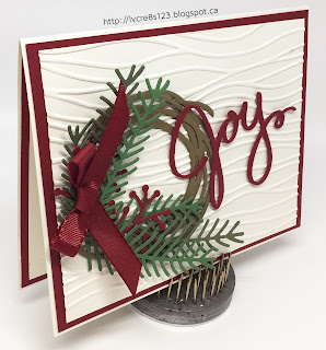

November

My November favorite is a card I taught at one of my stamp groups. It uses a lot of textural elements–embossing, die cuts, ribbon–to produce a pleasing Christmas card!


December

Though my cards for December were few and far between, I do have a favorite. The card was my first use of a new stamp set from the Occasions Catalog, Beautiful You, and also my first play with the new Watercolor Pencils. In addition, I also got to use the Stitched Shapes Framelits which I absolutely love!


I hope that you've enjoyed my review of my favorite stamping projects throughout 2016! I said at the beginning of this post that the end of the year was a time for both reflection and goal setting. The review of my favorite projects takes care of reflection.

I am hoping that you, my blog readers, will help me with goal setting. I would like to know what sorts of techniques and projects you would like to see and read about in the 2017. This will help me to formulate my goals for the coming year! I would appreciate you leavng me a comment below.

I wish each and every one of you a Happy New Year and all the best for 2017!

Friday, October 7, 2016

Pretty Paisley Birthday

Linda Vich Creates: Pretty Paisley Birthday. Petals & Paisleys DSP is teamed with the Cable Knit Embossing Folder to produce this formal and ornate birthday card.
I don't know why I waited so long to purchase the Paisleys & Posies Stamp Set, coordinating Thinlits and DSP–they are GORGEOUS! And yes, I am shouting!

When I saw the sheet of Night of Navy DSP with the copper embossed paisley print, I knew that I wanted to pair it with the (you guessed it!) Cable Knit Embossing Folder.

I started by cutting a standard card base from Night of Navy card stock and then cut a piece of the DSP to 5.5 x 4.25" to fit perfectly on the card front.

I cut a strip of Night of Navy card stock and embossed it with the Cable Knit Embossing Folder and then wrapped several times with the Copper Metallic Thread, securing it at the back with Fast Fuse. I then adhered the embossed strip to the DSP and then that to the card front using Fast Fuse.

I stamped the sentiment from the Birthday Blooms stamp set on Night of Navy using Versamark and heat embossed with the Copper Embossing Powder. I die cut the sentiment using the Layering Squares as well as die cutting a piece of the Copper Foil using the matching scalloped square.

Both pieces were transformed into rectangles by using this trick from Patty Bennett. I adhered the die cuts together using liquid adhesive–I find that this adhesive works best for centering these die cuts because it gives you the wiggle room you need to get the right placement. I adhered the sentiment on top of the embossed strip using Dimensionals.

A matte of Very Vanilla was cut for inside the card. I used the Paisleys & Posies with Night of Navy ink to stamp along the bottom of the matte. I then used a Versamark marker to edge the matte and then heat emboss with the Copper Embossing Powder. The matte was adhered with Fast Fuse to complete the card.

Linda Vich Creates: Pretty Paisley Birthday. Petals & Paisleys DSP is teamed with the Cable Knit Embossing Folder to produce this formal and ornate birthday card.

Linda Vich Creates: Pretty Paisley Birthday. Petals & Paisleys DSP is teamed with the Cable Knit Embossing Folder to produce this formal and ornate birthday card.
Click photo to view details in larger size

Don't you just love this? Though the copper is hard to photograph–it tends to look like gold–I'm sure you will agree that this paper and stamp set is truly stylish and ornate and it looks well with the clearly defined cable knit embossing.


Friday, April 8, 2016

Birthday Blooms For Kylie Bertucci's International Stampin' Up Blog Highlight

Linda Vich Creates: Birthday Blooms For Kylie Bertucci's International Stampin' Up Blog Highlight. Stunning Pacific Point watercolored blooms on Typeset DSP perch atop an embossed brick wall.I have been looking forward to participating in Kylie Bertucci's International Stampin' Up Blog Highlight. The theme is Love–any kind. However, as the time to post my project drew nearer, I still had no inkling of what I was going to create!


In the meantime, I have been working on some other projects that have gone awry so I took the evening off and watched tv.

Then, just before going to bed last night, an idea for my project popped into my head! I sat down and sketched it out, noting all the color and paper details, including a new technique that I wanted to try. Just the other day, Michelle Long had posted a card she had created by painting with her Aqua Painter filled with rubbing alcohol. I loved the technique and decided to use it on my card. Satisfied that I had noted everything I needed I headed off to bed.

Today, I sat down in my craft room to create my project and it came together quite nicely–almost exactly as I planned it except for a color change and a change in how I was going to add my sentiment.

I started by designing out the measurements for my project in my Silhouette Cameo design software. Once I knew the actual sizes of paper I needed, I proceeded to cut:
  1. 3 1/2 x 3 1/2" Typeset DSP
  2. 3 3/4 x 3 3/4" Basic Black matte
  3. 5 5/8 x 5 5/8" Pacific Point matte
  4. 6 x 6" Basic Black card base
On the Typeset DSP I stamped the floral image from Birthday Blooms with Jet Black Stazon Ink. I used Stazon instead of Basic Black Archival because I would be using alcohol in my Aqua Painter instead of water. I proceeded to paint the image using Pacific Point, Cucumber Crush, and Crushed Curry reinkers.

I loved how this turned out! It really is such a fun technique! I started with very little color and then built it up as the color dried very quickly due to using the rubbing alcohol instead of water. This method works much better than water on normal paper because it dries so fast!

After my image had dried completely, I placed the paper between a couple of sheets of scrap paper, covered it with an old pillowslip and ironed it! The paper had bubbled a bit in the area where I had painted but ironing got it completely flat again! I adhered the painted paper to a black matte using Fast Fuse Adhesive.

Next, I embossed the Pacific Point matte with the Brick Wall Embossing Folder. To give the embossing a more distinct look and to give the wall a bit of character, I sponged over the matte with Night of Navy ink.

For a bit more texture, I used Tear & Tape to adhere two pieces of Basic Black 3/8" Stitched Ribbon diagonally across the matte. Once the ribbon was in place, I adhered a piece of self-adhesive black fun foam and then adhered the matte to the card front using Fast Fuse Adhesive. The fun foam really works well to provide lift to a matte but to do so evenly. I used Dimensionals to adhere the painted image to the middle of the embossed matte.

Now this is where my plans for this project changed. I had wanted to white emboss a sentiment on black card stock. However, because the Typeset DSP has a Very Vanilla background, the white would have looked wrong which leads me to ask, "Why doesn't Stampin' Up have any Very Vanilla Embossing Powder?"

After choosing my sentiment from the First Sight stamp set, I decided to stamp the words and cut them up. I stamped three sentiment "pieces" of Very Vanilla with Jet Black Stazon ink and then trimmed them down in size. For the word, LOVE, I used my MISTI to stamp it first in Basic Black Archival and then in Versamark and heat embossed it with Gold Stampin' Emboss Powder. I inked the edges of each piece using Basic Black Archival ink.

I added Dimensionals to the backs of each sentiment and laid them out on the painted matte. After finding a pleasing arrangement, I used Glue Dots to adhere loops of Gold Metallic Thread behind LOVE to make it the focal point of the sentiment. I added a rhinestone to the "O" as well as three other rhinestones, which I colored with a Copic marker, for the front of the card.

For the inside of the card, I cut a matte from Very Vanilla and stamped the floral image in Pacific Point. I inked the edges of the matte before adhering it with Fast Fuse to complete the card.

Linda Vich Creates: Birthday Blooms For Kylie Bertucci's International Stampin' Up Blog Highlight. Stunning Pacific Point watercolored blooms on Typeset DSP perch atop an embossed brick wall.

Linda Vich Creates: Birthday Blooms For Kylie Bertucci's International Stampin' Up Blog Highlight. Stunning Pacific Point watercolored blooms on Typeset DSP perch atop an embossed brick wall.

Linda Vich Creates: Birthday Blooms For Kylie Bertucci's International Stampin' Up Blog Highlight. Stunning Pacific Point watercolored blooms on Typeset DSP perch atop an embossed brick wall.

Linda Vich Creates: Birthday Blooms For Kylie Bertucci's International Stampin' Up Blog Highlight. Stunning Pacific Point watercolored blooms on Typeset DSP perch atop an embossed brick wall. 

I'm really liking how my card turned out! If you like it too, could you please vote for my card by visiting Kylie's Blog? To vote, just look for the photo of my card–mine is number 28–and then click on the little heart in the top right of the photo. It should turn red once you have voted. If my card gets into the top five, I will be able to take part in an International Blog Hop! I would really appreciate your help with this because this is such a great opportunity!

Thank you for stopping by today!


Wednesday, March 9, 2016

Birthday Blooms and Botanicals Meet Shabby Chic

Time to change things up a bit by combining some watercoloring with a shabby chic style!

Today's design of this early Mother's Day card resulted from my color choice for watercoloring the lovely Birthday Blooms stamp. I have seen a lot of variations of this flower being colored but not too many yellow ones. I decided that I would use a different yellow hue for the flower by combining So Saffron and Delightful Dijon for a rich, dark yellow hue.

I started by stamping on watercolor paper with Basic Black Archival ink. I used my MISTI so I was then able to stamp in Versamark which allowed me to heat emboss using Clear Stampin' Emboss Powder.

Using my Aqua Painter, I wet a few sections of the stamp at a time and then colored the sections with So Saffron reinker. I used my heat tool to dry my work and then added in some shadowed areas using the Delightful Dijon reinker.

For the centre of the flower I used Soft Suede reinker. For the leaves, I used Old Olive and after drying, Mossy Meadow for the shadows.After completely drying the my work, I fussy cut the flower.

Next, I cut two ovals, Hello Honey and Mossy Meadow, from papers in the Botanical Gardens DSP. I used a Distress Tool to distress the edges of each. I sponged the edges with Delightful Dijon and Cajun Craze. These were adhered using Dimensionals. The flower was also adhered in the same way.

I cut a card base for a 6 x 4.75" card from Delightful Dijon. After scoring and folding, I distressed the edges and sponged them and the top of the card with Delightful Dijon. I cut a flowered matte from the Botanical Gardens DSP and distressed its edge and inked it with Cajun Craze. I wrapped two layers of the Delightful Dijon 1" Ribbon around the matte (two layers to make the color deeper) and taped the ends on the back. The matte was adhered to the card base using Fast Fuse Adhesive.

I adhered a small strip of paper to the middle of the ribbon and put Fast Fuse Adhesive on it. I layered some Lost Lagoon Thick Twine, from the now retired In Colors Accessory Pack, over the adhesive to accentuate the tiny flowers on the paper. The oval mattes were then adhered over top with Dimensionals.

I used the banner die from the Large Numbers Framelits Dies to die cut a piece of Cajun Craze patterned paper from the Botanical Gardens DSP and another from Cajun Craze card stock. I stamped the sentiment from the Crazy About You Stamp Set on the patterned paper with Basic Black Archival ink and stamped again with Versamark. I heat embossed with Clear Stampin' Emboss Powder and then layered the patterned paper sentiment on top of the Cajun Craze card stock for stability. This was adhered to the card front with Dimensionals.

Inside the card, I cut a matte from the same flowered DSP. I cut a smaller matte from the now retired Naturals White card stock. I distressed both mattes, inking the edges with Cajun Craze and Delightful Dijon. I stamped the sentiment from the First Sight Stamp Set in Mossy Meadow. The mattes were layered and adhered inside the card with Fast Fuse Adhesive.


I really like the shabbiness and the rich hues in this card!

Have you tried the Shabby Chic style? Let me know in the comments below!