Showing posts with label distress inks. Show all posts

Thursday, March 31, 2016

Hydrangea Birthday Card

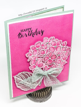
March 31st is my daughter's 22nd birthday. What better way to celebrate it than to use a new stamp and die set to create her birthday card?

Not only did I use a new stamp and die but I chose to use a new technique–Distress Ink Lifting. Jennifer McGuire has a great video tutorial for this on her blog.

I chose to use the Mondo Hydrangea stamp set by Julie Ebersole and its matching die set, just like Jennifer used in her tutorial.

Because Jennifer said that this technique worked best on card stock, not watercolor paper, I chose a piece of the Thick Whisper White card stock. Using my MISTI, I stamped the hydrangea and leaf using Versamark Ink. On another piece of the paper, I stamped again and also stamped the two blossom images that could be die cut. The stamped images were heat embossed using White Stampin' Emboss Powder.

The next step was to take a distress ink, in my case Picked Raspberry–I wanted to create hydrangeas that were pink with a hint of green–and rub it entirely over the image. I did this for my first set of the stamped images. (For the second set of images, I knew I would be die cutting them so I concentrated on inking only the images and a thin halo around them. I did these images after totally completing the water part of the technique as I didn't want the ink to dry out.)

I love the vibrancy of this ink!

Immediately after inking the matte and images, I took a small paintbrush and dropped water into each section of the images, causing the ink to be lifted away, revealing a paler version of the ink. The ridges of the embossing work to corral the water in each section.

After completing this step, I took some Bundled Sage distress ink, smeared some on my craft mat and then took my wet paintbrush to it. I took this green and added it to the edges of the blossoms, the leaf, and the stem.

I repeated this entire process with the second set of images that I had stamped and then used my heat tool to dry them all thoroughly.

My main stamped panel was trimmed down and I stamped the sentiment from the Rose Wonder stamp set using Basic Black Archival Ink. The stamped matte was then mounted onto a piece of white, self-stick fun foam to help even out the surface. It was then mounted on a very thin matte of Thick Whisper White card stock and onto the front of a Mint Macaron card base.

The other stamped images were die cut and adhered onto the previously stamped image using Dimensionals.

This looked pretty enough but I knew how to pump it up a notch–Wink of Stella! The glimmer from that made it even more beautiful, especially against the Picked Raspberry background. The distress ink dried so well blended that it looked like it was card stock!

I added a bow made from the Minted Macaron 1" Dotted Lace Trim and some rhinestones to complete the card front.

For the inside of the card, I used Picked Raspberry to stamp portions of the hydrangea on a matte of the now retired Naturals White card stock. I inked the edges in both Picked Raspberry and Bundled Sage and adhered the matte with Fast Fuse to complete the card.


I am very pleased with how this card turned out! I liked using the Distress Ink Lifting technique and will definitely use it again.

I'd love it if you'd take the time to leave me a comment below! See you next time.


Friday, March 18, 2016

Watercolor Markers, Distress Inks, and Easter

For my card today, I incorporated Stampin Up as well as some of my many other crafting supplies! My card actually started as an entry for a "yellow" color challenge but became something else entirely!

I started by creating an ombré effect using my yellow toned distress inks on Watercolor paper. I used squeezed lemonade, mustard seed, scattered straw, fossilized amber, and wild honey but in the end, I had to rework my ombré so the final lineup was mustard seed, fossilized amber, wild honey, rusty hinge, spiced marmalade and ripe persimmon. To give some definition to the edges, I added walnut stain.

Next, I decided to use my Zig Clean Color Real Brush Markers to color a focal image. I chose to use the Hyacinth from the Helping Me Grow stamp set and stamped it in Basic Black Archival ink on watercolor paper using my MISTI. It is often difficult to get an image stamped perfectly on watercolor paper in one go; the rougher texture of the paper seems to either absorb or deter ink. MISTI to the rescue!

I zapped the image with my heat tool to be sure it was dry before beginning my coloring. I used the following: Lilac, Light Violet, Purple, Mid Green and Olive Green. I just LOVE coloring with these markers because it seems so effortless!

The Big Shot along with a die from the Circles Collection Framelits was used to die cut the colored image as well as a die cut a matte from Old Olive card stock. I used a sponge dauber with Walnut Stain distress ink to give some definition to the edges of both. The colored image was then adhered to the matte with Dimensionals.

I used the Fluttering Embossing Folder to emboss the ombré matte (the only one that would fit since I was making a non-standard card size). I adhered the embossed background to a very thin Elegant Eggplant matte and then attached both to an Old Olive card base. The focal image was adhered to the matte with Dimensionals.

I chose a piece of Whisper White Seam Binding to color with distress inks to match my project. On my craft mat I dabbed wilted violet, dusty concord and seedless preserves. I spritzed them and my ribbon with water and then proceeded to dab my ribbon into the colors until I was satisfied with the results. I kept crinkling the ribbon into a ball in my hands (I wore disposable gloves so my hands would still look like hands when I finished!) and then dried it with my heat tool.

Cutting a small piece off one end of the ribbon, I wrapped the rest around three fingers. I tied it in the middle with the piece I had cut off to form my crinkly bow. I adhered the bow to my card front using Glue Dots.

I stamped my sentiment from the Crazy About You stamp set onto a strip of Basic Black card stock using Versamark and then heat embossed it using White Stampin' Emboss Powder. I used the Banner Triple Punch to flag one end. The sentiment was adhered to the card front with Fast Fuse Adhesive.

To complete my card, I used (for the first time!) some Rainstones that I had purchased from Papertrey Ink some time ago after watching a video tutorial that showed them being used on a card. I thought they looked gorgeous! I adhered some to my card front using a combination of Multi Medium Matte (for the small ones) and Zots Clear Adhesive Dots-Bling Tiny for the larger ones. I got my Zots at Michaels for $7.99 for 325. They work really great! I think I may try them for sequins or other tiny embellishments in the future.


I did not embellish the inside of my card but may do so before giving it out for Easter. Thanks for checking out my post today!


Thursday, February 11, 2016

Distress Ink Valentine

Today I set out to create a Valentine card for my husband. I had planned to case a card by Amy Rysavy. It was simply gorgeous and I thought I could recreate the watercolor look by using the Stampin Up reinkers.

I set out with the colors I had chosen–Coastal Cabana, Bermuda Bay, and Island Indigo–but the colors just didn't blend the right way. I tried again by watercoloring by putting distress inks on my craft mat and adding water but the colors weren't nearly as intense and I didn't have any reinkers for my distress inks.

So, that left sponging the background. I could have sponged with the Stampin Up inks but the distress inks blend so well so I went with them.

I cut a matte from watercolor paper and started sponging. In the end, I used 10 different distress inks to create my panel! I used Peacock Feathers, Cracked Pistachio, Mermaid Lagoon, Pine Needles, Blueprint Sketch, Faded Jeans, Chipped Sapphire, Evergreen Bough, Lucky Clover and Black Soot. And how do I remember what I used? I snapped a photo of course! It's a great way to record what you are using as you use it. I also used a sponge dauber to apply a fine line of Basic Black Archival Ink to the edges of the matte.

Inks used to distress the matte for the card front
After creating my background, I die cut the Queen of Hearts die from Memory Box using Silver Glimmer Paper. Because the design is so delicate and intricate, I used a metal shim with my Magnetic Platform as well as placing a dryer sheet beneath the glimmer paper.

What a beautiful die cut! It looked stunning placed on the distress ink background. It was then that I decided to add some Silver Cording Trim, wrapped around the bottom of the matte. I adhered the matte to a very thin Whisper White matte, using Fast Fuse Adhesive.

For the sentiment, I simply used the XOXO stamp from the Bloomin' Love Stamp Set. I stamped in Versamark on Basic Black card stock and embossed with White Stampin' Emboss Powder. I used the Bitty Banners Framelits to die cut the sentiment and then cut off the one end. Using the Confetti Hearts Border Punch, I punched a few tiny hearts from the Silver Glimmer Paper and glued them on the banner. I used Fast Fuse Adhesive to adhere the sentiment under the Silver Cording Trim.

I then attached the distressed matte and Whisper White matte to an Island Indigo card base using foam tape. I like to use foam tape when I watercolor because I think it holds the paper better, with less warping.

To attach the die cut, I decided to use spray adhesive. I placed the die cut face down in a box I use as my spray booth and coated it with the spray. Definitely easier than using the Fine Tip Glue Pen! However, it didn't adhere in all places so I ended up adding some Multi Medium Matte to finish the job. I adhered a sprinkling of sequins to complete the front of the card.

I cut a Whisper White matte for the inside of the card and stamped the large intricate heart from the Bloomin' Love Stamp Set. using Basic Black Archival Ink. I zapped it with my heat gun to be sure it was dry before beginning to sponge once again.

I only used a few inks this time–Blueprint Sketch, Pine Needles, Evergreen Bough, Peacock Feathers and Chipped Sapphire. It wasn't the best blending job ever but it still looked nice! I adhered the matte with Fast Fuse Adhesive to complete the card.

Completed inner matte with distress inks that were used


I think my husband will like the card. What do you think? Leave me a comment below–I'd love to hear from you!


Friday, January 29, 2016

Teal Toned Atypical Valentine

In my blog post Rustic Wooden Valentine I shared a technique I had learned for creating your own Woodgrain. I had so much fun making the first woodgrain that I made a few in other colors! Today I made use of these ones:

Panels created using the Woodgrain Technique and Weathered Wood, Peacock Feathers, Evergreen Bough and Black Soot Distress Inks.

Be sure to check Rustic Wooden Valentine if you didn't already read about the Woodgrain Technique. These colors are my favorites so I couldn't go too long without using them! I had another idea for a Valentine card that used both the larger panel for a background and the smaller panel for die cutting.

I started with a Bermuda Bay card base and adhered the background panel to it with Dimensionals. Using the Hearts Collection Framelits, I die cut three hearts from the smaller panel. I used a sponge dauber to add Black Soot Distress Ink around the die cuts.

I cut a piece of vellum to lay over the Woodgrain panel but still show the ends. I used a sentiment from the now retired Happy Watercolor Stamp Set to stamp with Versamark and then heat embossed with Silver Stampin' Emboss Powder.

I laid out my hearts on top to establish their positions and then cut some thick Bermuda Bay Twine to fasten between them. I used glue dots to attach the twine to the hearts. I applied Dimensionals to the back of each heart and then adhered them to the vellum. I then adhered the vellum to the Woodgrain panel by applying glue dots to the vellum under the hearts so that the adhesive would not show.

I adhered a selection of sequins to the vellum using glue to provide interest and a little sparkle. Gotta have sparkle!

For inside the card I used a matte of Thick Whisper White (because I had a piece the right size handy, otherwise I would have used the regular Whisper White) and used the heart from the Bloomin' Love Stamp Set to stamp with Versamark and heat emboss again with silver. I also stamped the little hearts from the Perpetual Calendar Stamp Set in Bermuda Bay. I inked the edges of the matte with more Bermuda Bay and then adhered the matte with Fast Fuse Adhesive to complete the card.


Sorry about the color here . . . it looks like Island Indigo but it really is Bermuda Bay like above!

I think that the teal tones of the Distress Inks work really well with Bermuda Bay to provide an atypical Valentine!


I am entering this in the Stamp Ink Paper Challenge #32 and I played the diagonal from the bottom left to the top right.

SIP Tic Tac Toe 32


Wednesday, January 27, 2016

Rustic Wooden Valentine

So, have you tried the latest paper crafting trend–creating your own wood grain? A lady in my Stamping Enablers Facebook group posted a tutorial for creating your own wood grain panels using Distress inks and glue and several people have been trying the technique.

Basically, you score a piece of watercolor paper to look like planks, flip the sheet over and rub distress inks over it. You can add water to help the colors blend but that's it! I hadn't given my new mini distress inks a good work out yet so this was a good project for them!

I knew before starting that I would be using one of my panels to make a Valentine so for my first effort, I assembled a number of red inks as well as some of my neutrals. I used a strip of watercolor paper to swatch out my inks as a reference before beginning.

I wanted to use the rough side of the watercolor paper for my wood so I scored on the opposite side. I decided to use a score of every half inch.

I then started dragging my lightest red down the panel. I then alternated between my other reds, adding strips of color around the panel until I was totally satisfied. During the process, I also sprayed water a few times and blotted with a paper towel and then added more ink. I also added in some of my neutrals. In the end, I used all of these: Candied Apple, Barn Door, Fired Brick, Aged Mahogany, Hickory Smoke, Ground Espresso, and Black Soot.

This is what my first attempt looked like:

First attempt at wood tutorial

My first try and I was hooked on this technique! I decided to try a few other color combinations while I had the inks at hand. You'll probably see these used in other projects sometime soon!

Here are some more that I did:

Second attempt with additional, smaller scale, scored panel
Third attempt. I'm definitely hooked!
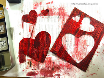
Eventually, I turned back to my first red panel and die cut three hearts from it, angling my hearts so that the planks ran at an angle. For the smaller hearts, it would have been better if I had had a smaller scale of wood panel because you can't see much more than one or two planks in the die cuts. I learned from this so I created a smaller scale panel for the teal color that I wanted to work with on a future project.

Die cuts from panel.
After die cutting the hearts, I inked the edges with Aged Mahogany and then used my Distress Glaze to seal the colors so that they wouldn't come off on anything else as I worked with them.

I cut a matte from Coastal Cabana and embossed it using the Happy Heart Embossing Folder. I inked the edges using Early Espresso.

On a piece of Thick Whisper White I stamped the sentiment, using my MISTI; I used Early Espresso and then Versamark, heat embossing it with Clear Stampin' Emboss Powder. To give the tag a little interest, I used the Curvy Corner Trio Punch on the corners. I then inked the edges using both Aged Mahogany and Candied Apple.

I adhered both the tag and the heart die cut to the embossed matte using Dimensionals. I tied a length of Thick Coastal Cabana Twine around the matte and then adhered it to a Early Espresso card base using Dimensionals.

For the inside, I sponged the edges of a Whisper White matte using Coastal Cabana and then adhered the two smaller hearts using Fast Fuse Adhesive and Glue Dots.


To complete the card, I added a variety of sequins to the heart and a single red heart sequin to the tag.


My card will be entered in the following challenges:


Love Theme Challenge 179 for the Paper Craft Crew.


I encourage you to try the woodgrain tutorial and then link me to your results. It's so much fun!


Saturday, August 8, 2015

And Now For Something Completely Different!

Linda Vich Creates: And Now For Something Completely Different! Art journal page illustrating the poem, "Mother To Son" by Langston Hughes.For a long time now, I have been admiring art journaling pages, created using a variety of mixed media techniques. In particular, I enjoy the layouts created by Vicky Papaioannou and often watch her videos of how she creates her art journal layouts.

Over a little while I have been collecting various supplies–gesso, gel medium, molding paste, distress paints, gelatos, stencils and just recently purchased a Moleskin Art Plus Sketchbook. It was a 5.5 x 8.5" in size.

Finally, I decided I was ready to take the plunge! Now, what to do a layout about?
A lot of art journal layouts start with a prompt of some sort. It could be a theme, a technique, a quote, etc. I decided to use a poem.

Back in my teaching days in Sagkeeng, the English teacher at the high school presented a wonderful poem written by Langston Hughes to the class. The poem was called "Mother To Son" and basically the mother was encouraging her son to keep going when the going got tough and the poem used a staircase as a very effective metaphor.

To start the process of the layout, I used Soft Gel Matte to glue two journal pages together for either side of the layout. I used my Heat Tool to dry the pages and then covered both pages of my layout with the same gel and adhered some Tim Holtz Tissue Paper to both pages. Gel was also brushed over top of the tissue. I dried this and then trimmed off the excess tissue paper.

At this point, I used old pages from a magazine to put between the pages I was working on and the other pages in the book.

Next, I brushed Liquitex Gesso over the tissue, alternating with a bit of water. This served to make the print from the tissue recede without covering it completely.

I then began to color the background of the layout. I wanted a dark purple but the Seedless Preserves Distress Paint I had seemed a bit bright so I thought I would mix it a bit with Spun Sugar. I dabbed on paint and spritzed with water and then used a brush to apply it to the pages.

Linda Vich Creates: And Now For Something Completely Different! Art journal page illustrating the poem, "Mother To Son" by Langston Hughes.

The color was still too bright. I thought I could "dirty up" the color so after drying it, I brushed on some Gathered Twigs Distress Ink. That helped a bit but in restrospect, I probably should have laid down some black paint and then applied the purple on top to make it the dark purple that I had wanted. This is where my lack of art training failed me!

Linda Vich Creates: And Now For Something Completely Different! Art journal page illustrating the poem, "Mother To Son" by Langston Hughes.

Linda Vich Creates: And Now For Something Completely Different! Art journal page illustrating the poem, "Mother To Son" by Langston Hughes.

Next, I added a border around my pages by brushing on Vintage Photo Distress Paint around the edges and brushed it with a wet brush. I dried and then repeated this step. I also brtushed Walnut Stain Distress Paint around edges and brushed with a wet brush; dried again with my Heat Tool.

Linda Vich Creates: And Now For Something Completely Different! Art journal page illustrating the poem, "Mother To Son" by Langston Hughes.

Linda Vich Creates: And Now For Something Completely Different! Art journal page illustrating the poem, "Mother To Son" by Langston Hughes.

Linda Vich Creates: And Now For Something Completely Different! Art journal page illustrating the poem, "Mother To Son" by Langston Hughes.

Linda Vich Creates: And Now For Something Completely Different! Art journal page illustrating the poem, "Mother To Son" by Langston Hughes.

I used the Tim Holtz Clockwork Stencil with Black Soot Distress Ink and dauber to add some interest.

Linda Vich Creates: And Now For Something Completely Different! Art journal page illustrating the poem, "Mother To Son" by Langston Hughes.

I mixed Light Molding Paste with Tarnished Brass Distress Paint and used the Tim Holtz Burlap Stencil to add texture to the pages.

Linda Vich Creates: And Now For Something Completely Different! Art journal page illustrating the poem, "Mother To Son" by Langston Hughes.

This was where I forgot about taking pictures as I went! The last thing I did to the background was to take a small paintbrush and mix a little gesso with water and flick the brush to create paint spatters on the layout. I repeated the process with black by mixing a little Black Soot Distress Ink with the gesso.

I printed a photo of a staircase that I had taken in an abandoned house near Beausejour. The photo was in black and white but I decided to color it in Photoshop before printing it out on Whisper White card stock. I trimmed the photo to size and applied gel medium on top of photo to seal it and allow me to further work with it.

Because the color of the photo was not quite what I needed, I brushed on Gathered Twigs Distress Ink with wet brush to alter the color so it would work better with the layout. I dried it and then inked the edges of the photo with Vintage Photo Distress Ink. I then applied gel medium to photo to adhere it to the page, as well as over top of it, and dried it.

I printed the poem on Whisper White card stock and cut out each line of the poem. I first brushed gel medium over each piece to prevent the ink from running but still some of it ran. Next time I will try to seal it by using Distress Micro Glaze by Tim Holtz.

I inked each line of the poem with Antique Linen and inked the edges with Vintage Photo Distress inks. Gel medium was used to glue all the lines down and also cover them with the gel.

I used one of the border stamps from the Indigoblu Rugged Edge Stamp set with Ranger Archival ink to add a border to my pages. I also added a border of Black Soot Distress Ink to the pages before giving each page one last coat of gel medium (This is where I definitely made an error! Note to Self: Do not put gel medium over molding paste!)

Linda Vich Creates: And Now For Something Completely Different! Art journal page illustrating the poem, "Mother To Son" by Langston Hughes.


Linda Vich Creates: And Now For Something Completely Different! Art journal page illustrating the poem, "Mother To Son" by Langston Hughes.

Linda Vich Creates: And Now For Something Completely Different! Art journal page illustrating the poem, "Mother To Son" by Langston Hughes.


At this point, I considered my art journal layout to be complete! However, the next morning, I realized that I had forgotten to use the special Crackle Paste I had purchased for this layout! I applied it just over the photo and spoiled my layout! I thought this stuff was supposed to dry clear and provide a crackle finish but it didn't! It kindo f took on the color of the photo but lighter and gave a grainy texture but not what I wanted! Next time I will use Tim Holtz's Crackle Paint in Clear Rock Candy! If you are interested in reading the poem, be sure to click on the photos to see an enlarged version.

This was definitely a learning experience for me! With the exception of the crackle paste issue and brushing the gel medium over the molding paste, I'm pleased with my layout! I look forward to creating my next one soon!

Have you tried art journaling?Leave me a comment below!

Friday, June 19, 2015

Watercolored Best Thoughts


I had the day off to play in my craft room today but it was hard to choose what to play with first!

I finally decided to use the flower stamp in the lovely Hostess set, Best Thoughts.

This morning while eating breakfast, I was viewing cards in a blog hop for Catherine Pooler's newest online class, In The Mood. A special Mood Board was created just for the hop. Click on the image below to check out the wonderful creations in this hop!

In The Mood Blog Hop

Who wouldn't be inspired when viewing a Mood Board like this? Anyway, one of the cards shared by Heather North caught my eye:


To create my card using her technique I started with a 4 x 5.25" Watercolor matte. Using my MISTI and Versamark ink, I stamped the flower and then heat embossed it using Clear Stampin' Emboss Powder.

I taped the matte onto my craft sheet with Washi tape to stop it from warping.

I used a small paint brush to paint some clear water onto the flower. On my Tim Holtz Craft Mat I stamped some distress inks: Peacock Feathers, Spun Sugar and Picked Raspberry. I dabbed the colors onto the flower, adding more water as needed to get an effect I liked.

Because I had gone out of the lines of the flower a little, I decided to paint a very pale background wash with the Spun Sugar ink. I heat set the flower and then painted the background and heat set it as well. I sprinkled a few water drops on but they didn't react as well as usual because I really watered down the ink so it wouldn't be so intense.

I made sure the whole painting was completely dry and then removed the washi tape. I then trimmed the matte down to remove the white edges.

I adhered the watercolor matte to a Whisper White matte using Fuse Fast. Using MISTI I stamped the sentiment using Stazon Jet Black ink because I wanted the sentiment to overlap the stem of the flower and because it was embossed, the only ink that would adhere to it would be Stazon.

I tied a sheer bow around the matte and then adhered it to a Bermuda Bay card stock matte. Finally, the whole thing was adhered to a Perfect Plum card base using Dimensionals.

To complete the card, I added a sprinkling of Sparkling Clear sequins from Pretty Pink Posh.

Linda Vich Creates: Watercolored Best Thoughts. Distress inks applied as watercolor produce a delightful color medley on the Best Thoughts flower stamp.

Linda Vich Creates: Watercolored Best Thoughts. Distress inks applied as watercolor produce a delightful color medley on the Best Thoughts flower stamp.

Linda Vich Creates: Watercolored Best Thoughts. Distress inks applied as watercolor produce a delightful color medley on the Best Thoughts flower stamp.


I love the colors of this flower and the clear embossing seems to sparkle like the sequins! It is hard to see in the photos but the background really is a very soft pink color that really showcases the flower.

What do you think? Leave me a comment below!

Built for Free Using: My Stampin Blog

Thursday, June 18, 2015

Crazy Birds Birthday Card

Linda Vich Creates: Crazy Birds Birthday Card. Brilliant distress inks bring the Tim Holtz Crazy Birds stamps to life in this 65th birthday card.I had to create a card for our neighbor's 65th birthday so it gave me a chance to break out my Crazy Birds stamps from Tim Holtz! As soon as I saw these birds on Pinterest, I knew I had to get them. They were just too cute!

Using my MISTI, I started by stamping the two birds on Watercolor Paper using Versafine Onyx Black, heat setting the ink.

Because I didn't want to accidentally color over the eyes of the birds, I used Rubber Cement and a small paint brush to brush it onto the eyes, making sure I had a thick coat. I then heat set it to be sure it was completely dry.

I used my sponge daubers with Distress Inks to color the birds. Intense colors seemed to suit these birds so I chose Mowed Lawn, Salty Ocean, Mustard Seed, Spiced Marmalade, and I also used a Ripe Persimmon Distress Marker.

After the birds were completely colored, I used an adhesive remover from Stampin' Up! to get rid of the Rubber Cement. I used a White Gel Pen to color in the eyes and also used a Project life pen to darken the black of the eyes.

I fussy cut each bird, cutting off the legs and little bits of black.

I planned the placement of the birds on my Whisper White matte and then stamped each bird again on the matte. This allowed me to glue my colored birds over the stamped ones and give them back their feet and little bits of black!

I stamped the sentiment from Just Sayin' using Cucumber Crush and then die cut it with the matching framelits. I adhered it between the birds using Dimensionals.

I distressed the edges of the matte and inked them with Island Indigo. This matte was adhered to a Tangelo Twist matte using Dimensionals and then that matte was adhered to the Island Indigo card base using Fuse Fast. A few scattered sequins and the card front was complete!

For the inside of the card, I used Naturals White card stock for a matte. I stamped the sun from Kinda Eclectic in Tangelo Twist and heat embossed it using the Iridescent Stampin Emboss Powder.

Using Versamark, I stamped 65 on Island Indigo card stock and punched it with the 2 1/2" Circle Punch. I heat embossed the numerals with the Iridescent Stampin Emboss Powder and then adhered the circle with Dimensionals to the centre of the sun.

I inked the edges of the matte with Tangelo Twist and adhered the matte inside the card.

Linda Vich Creates: Crazy Birds Birthday Card. Brilliant distress inks bring the Tim Holtz Crazy Birds stamps to life in this 65th birthday card.


I'm pleased with how the card turned out and our neighbor loved it!


Built for Free Using: My Stampin Blog

Monday, March 30, 2015

Tim Holtz Meets Birthday Girl

Linda Vich Creates: Tim Holtz Meets Birthday Girl. A Tim Holtz-style card showcasing layered stencils, embossing, resist, and distress inks.I have a mostly non-Stampin' Up! card for you today.

For Courtney's 21st birthday, I decided to play with my Tim Holtz supplies—distress inks, distress paint and stencils.

I started by using Picket Fence (white) distress paint on a Whisper White matte with first the Dot Fade and then the Crocodile layering stencils. These are the coolest stencils—lots of funky, imperfect patterns with which to work!

After applying the paint I dried it with my heat tool and then started sponging on some distress inks. I used a combination of Evergreen Bough, Spun Sugar, Shaded Lilac, Vintage Photo and Scattered Straw. I then used a combination of Rusty Hinge, Gathered Twigs and Black Soot around the edges.

Next I used Tuxedo Black Memento ink to stamp (with MISTI, of course!) using the It Is Written stamp set from BoBunny.

Using Versamark, I stamped the dragonfly from the Dragonflies stamp set by Local King Rubber Stamps. I then heat embossed it with Gold Embossing Powder.

I stamped a 2 and a 1 and punched them with my 1/2" punch and inked them with some Rusty Hinge. These I glued in the top right corner of the card.

I then used the @SoSocial stamp set to stamp the sentiment and then punched it with the Word Window Punch. I also punched out a Modern Label. I applied Rusty Hinge and Twisted Twigs to both labels to distress them. They were layered with Dimensionals and adhered to the bottom right of the matte.

I knotted some Mossy Meadow thick Baker's Twine around the bottom of the matte and then adhered the matte to a Mossy Meadow card base using Dimensionals.

I inked up a Naturals White card stock matte using Rusty Hinge and Twisted Twigs and then stamped the sentiment from the Smart & Sassy Sayings stamp set by Hot Off The Press using Soft Suede.

A small dragonfly was stamped in Versamark and heat embossed with Gold Embossing Powder. The matte was adhered inside the card using Fuse a Fast. Gold Stickles were added to accent the sentiment.

Finally, sequins were added to the front of the card for a little sparkle.

Linda Vich Creates: Tim Holtz Meets Birthday Girl. A Tim Holtz-style card showcasing layered stencils, embossing, resist, and distress inks.

Linda Vich Creates: Tim Holtz Meets Birthday Girl. A Tim Holtz-style card showcasing layered stencils, embossing, resist, and distress inks.

What do you think of this card? A bit of a departure from my usual but I enjoyed making it!