Showing posts with label brick wall embossing folder. Show all posts

Thursday, April 6, 2017

Flourish Thinlits For Global Design Project #81

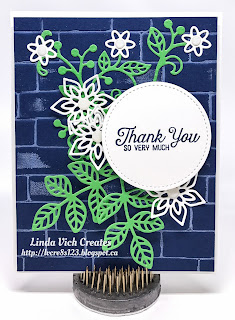
Linda Vich Creates: Flourish Thinlits For Global Design Project #81. Delicate Flourish Thinlits dress up a brick embossed background in this entry for #gdp081.
I often find that a color scheme can stir the mojo juices and inspire me to design a project. The Global Design Project #81 has a color challenge that did just that! The challenge was to combine Night of Navy, Whisper White, and any other color. Because Cucumber Crush will soon be retiring, I want to use it as much as I can before it is gone so I chose it for my additional color.

The one thing I knew was that I wanted to use the Brick Wall Embossing Folder for my background so I started by cutting a Night of Navy matte. Using my now retired brayer to ink up the top of the folder with Whisper White Craft Ink, I then placed my matte on the other side of the folder, closed it, and ran it through the Big Shot. This gave me some light "grout" lines on my brick-embossed card stock. After setting the ink with my heat tool, I adhered the matte to a Thick Whisper White card base using Foam Adhesive Strips.

I stamped the sentiment with Night of Navy on a scrap of Thick Whisper White and then die cut it using a circle from the Stitched Shapes Framelits. I used dies from the Flourish Thinlits to die cut leaves and flowers from Cucumber Crush and Thick Whisper White and then developed a pleasing design on my card front. After snapping a picture for reference, I took the design apart and then used liquid adhesive and Foam Adhesive Strips to adhere the die cuts and sentiment to the card front, adding White Perfect Accents for the flower centres.

Finally, to complete the card, I stamped the large flourish image on the inside of the card.

Linda Vich Creates: Flourish Thinlits For Global Design Project #81. Delicate Flourish Thinlits dress up a brick embossed background in this entry for #gdp081.

Linda Vich Creates: Flourish Thinlits For Global Design Project #81. Delicate Flourish Thinlits dress up a brick embossed background in this entry for #gdp081.

Linda Vich Creates: Flourish Thinlits For Global Design Project #81. Delicate Flourish Thinlits dress up a brick embossed background in this entry for #gdp081.

Do you like the color combo? You can pin the following image for future reference.

Linda Vich Creates: Flourish Thinlits For Global Design Project #81. Delicate Flourish Thinlits dress up a brick embossed background in this entry for #gdp081.

Don't forget to stock up on all things Cucumber Crush (and any of the other retiring In Colors) in my online store.

I will be entering this card in the Global Design Project #081. Won't you come and play too?


Thursday, March 2, 2017

You Light Up My Life Lighted Card

Linda Vich Creates: You Light Up My Life Lighted Card. A multicolored brick background showcases three copper embossed lanterns that light up when the sentiment is pressed.
Ever since I saw a card created using the new copper embossing powder, I have been wanting to make this card. Today I finally saw it through to completion!

I started by creating the background matte. This was inspired by a card created by Diane as seen on this Pinterest link. I used the Brick Wall Embossing Folder to emboss a piece of Watercolor paper and then sponged on inks–Tempting Turquoise, Emerald Envy, Cajun Craze and Night of Navy.

Using Versamark, I stamped two of the lanterns from the Moroccan Nights stamp set on Vellum and then heat embossed using Copper Stampin' Emboss Powder. I used scissors to fussy cut the lanterns.

I ran a length of the 5/8" Burlap Ribbon across the bottom of the card and taped it to the back. I used glue dots to keep the ribbon flat against the matte.

The sentiment from the Jar of Love stamp set was stamped with Basic Black on Emerald Envy card stock. A stitched oval was used to die cut the sentiment. A scalloped oval from the Layering Ovals Framelits was used to die cut Night of Navy and then Soft Suede was die cut with another stitched oval. These were sponged with Cajun Craze and layered using liquid adhesive and Dimensionals.

Next, I cut a Whisper White matte the same size as the brick matte. I positioned the lanterns on the matte and traced around them using a pencil, marking the spots where the light would show the vellum. Then, because I would be using the sentiment embellishment to press the "switch" to light the lanterns, I traced both the ribbon and the oval onto the white matte. I also used my Piercing Tool to poke through the white matte and through the brick matte so I would know where the light would be. Lastly, I scored 7/8" from the bottom of the matte and folded up to form the spot where the battery would sit.

Linda Vich Creates: You Light Up My Life Lighted Card. A multicolored brick background showcases three copper embossed lanterns that light up when the sentiment is pressed.
White matte showing traced lanterns, ribbon, and sentiment embellishment

I used a pencil crayon to draw two parallel paths, negative and positive, through the lantern tracings, with the end of the negative path above the fold and the positive end below the fold. I also marked positive and negative signs next to the ends so I could keep track which was which.

A Circuit Scribe Pen was used to trace over the paths I had drawn, filling in a solid circle at the end spot for each of the positive and negative paths. I then carefully peeled off one of the Chibitronic LED lights, being careful not to touch the sticky bottom. I adhered one LED within each lantern tracing. Each light was adhered across the positive and negative paths, with the point of the light on the negative path.

Linda Vich Creates: You Light Up My Life Lighted Card. A multicolored brick background showcases three copper embossed lanterns that light up when the sentiment is pressed.
Negative path traced with pen, positive path drawn with pencil crayon

Linda Vich Creates: You Light Up My Life Lighted Card. A multicolored brick background showcases three copper embossed lanterns that light up when the sentiment is pressed.
Completed paths with lights adhered, battery on negative spot

I placed the battery, text side up, on top of the negative spot and tested the circuit by pressing down the folded paper over the battery (completing the circuit by pressing the positive spot down onto the battery's positive side). It worked! If it hadn't, I would have carefully checked each path to make sure no gaps existed as well as checking that each LED was securely adhered.

Linda Vich Creates: You Light Up My Life Lighted Card. A multicolored brick background showcases three copper embossed lanterns that light up when the sentiment is pressed.
Battery enclosed with adhesive strips

Since the circuit was working, I then used pieces of Adhesive Strips to enclose the battery and keep it from moving around. I carefully folded the matte over the battery to adhere it. I then cut the excess folded card stock away.

The lanterns were adhered to the front of the brick matte using cut up Dimensionals and a drop of liquid adhesive for the chains of the lanterns. It was then, upon holding the card up to the light, I realized that the "hole" for each light did not look right behind the vellum so I further clipped out more of a hole behind each lantern's vellum piece.

I used more of the Adhesive Strips as well as some Dimensionals to adhere the brick matte over the white matte. The two mattes were then adhered to the front of an Emerald Envy card base.

Lastly, the sentiment embellishment was adhered over the burlap ribbon using Adhesive Strips.

Linda Vich Creates: You Light Up My Life Lighted Card. A multicolored brick background showcases three copper embossed lanterns that light up when the sentiment is pressed.

Linda Vich Creates: You Light Up My Life Lighted Card. A multicolored brick background showcases three copper embossed lanterns that light up when the sentiment is pressed.

Linda Vich Creates: You Light Up My Life Lighted Card. A multicolored brick background showcases three copper embossed lanterns that light up when the sentiment is pressed.


I hope you have enjoyed learning about how to make a light up card!


pt src="https://mystampinblog.com/Script/ShowcaseDetailsScript">

Friday, December 30, 2016

My 12 Favorite Projects From 2016

As we reach the end of the year, it is both a time for reflection and goal setting. I'd like to take this opportunity to look back at the projects I've created this year. Be sure to click on each image to be taken to the pertinent blog post for all the details.

January

My favorite for January is actually a tie for two images! I absolutely fell in love with the Sky Is The Limit stamp set and knew that I would use it often–it was perfect for masculine cards!


In creating a Valentine for a man, it is sometimes difficult to create a card not full of flowers and frilly hearts! For this card, I felt that the combination of Kraft card stock and black worked well for a masculine Valentine. You can see that I managed to squeeze in a few flowers but they are "masculine" flowers! I also think that the the various textural elements work well for a masculine card.


February

My favorite for February is one that earned me the Top Picks award for the Stampin' Royalty challenge #316.


March

Anyone that knows me well knows that I am partial to unusual combinations, whether that be food, colors, textures, etc. For the Global Design Project #025, I was required to use a color combo that I wouldn't have picked for myself. In working with it, I chose to use the Brick Wall embossing folder as an actual wall as a backdrop for a window that showcased a very simple stamp set–Vivid Vases. I was very pleased with my completed card!


April

My favorite for April also uses the Brick Wall embossing folder but the card it is used on is totally different. This particular card enabled me to take part in an International Blog Hop organized by Kylie Bertucci! I also enjoyed trying a new technique–painting with alcohol in my Aqua Pen and reinkers.


May

My favorite for this month was the project I designed for the International Blog Hop that I mentioned  previously. I utilized my all time favorite color, Blackberry Bliss, and added a lot of textural and glitzy elements to put this gate fold card over the top!


June

My favorite for this month actually comes from a set of cards I created as a prize for my Catalog Launch Party! The technique that I used was new to me but it was oh such fun! The technique involves using an embossing folder with a large surface, in this case butterflies, and then stamping very lightly several times over the entire embossed image using a a flourish stamp. The stamping is repeated until the ink is totally used up on the stamp and then it is re-inked and stamped again. This technique provides a lot of dimension.


July

July's favorite card also uses the Brick Wall embossing folder and makes uses of several textural elements to create a truly dimensional card.


August

My favorite for this month combines both colors and textures and uses a bundle, Thoughtful Branches, that I was very disappointed was available for only a short time.


September

September's favorite also uses the Thoughtful Branches Bundle as well as a a dots stamp from the Swirly Birds stamp set. It is a fun technique that produces a lot of texture and color.


October

My favorite for October uses a combination of Kraft card stock and black in a non-traditional sort of Christmas card. I think this card would work well for a masculine card but I know that I would love to receive a card like this one as well!


November

My November favorite is a card I taught at one of my stamp groups. It uses a lot of textural elements–embossing, die cuts, ribbon–to produce a pleasing Christmas card!


December

Though my cards for December were few and far between, I do have a favorite. The card was my first use of a new stamp set from the Occasions Catalog, Beautiful You, and also my first play with the new Watercolor Pencils. In addition, I also got to use the Stitched Shapes Framelits which I absolutely love!


I hope that you've enjoyed my review of my favorite stamping projects throughout 2016! I said at the beginning of this post that the end of the year was a time for both reflection and goal setting. The review of my favorite projects takes care of reflection.

I am hoping that you, my blog readers, will help me with goal setting. I would like to know what sorts of techniques and projects you would like to see and read about in the 2017. This will help me to formulate my goals for the coming year! I would appreciate you leavng me a comment below.

I wish each and every one of you a Happy New Year and all the best for 2017!

Thursday, August 4, 2016

Thoughtful Branches Thank You

Linda Vich Creates: Thoughtful Branches Thank You. A lovely hydrangea blossom from Thoughtful Branches, in shades of Bermuda Bay and Island Indigo, rests against a grungy, Peekaboo Peach brick background.
When I sat down to design this card, I knew that I was going to use Bermuda Bay and Island Indigo, because they were favorites of the recipient, and I also added Cucumber Crush because the three colors produced a lovely analogous color scheme. However, I chose a complementary color, Peekaboo Peach, to really add some punch.

I started by stamping the blossoms, from the Thoughtful Branches stamp set, in both Bermuda Bay and Island Indigo on Thick Whisper White. They were die cut with the matching Thinlits. A set of leaves were also die cut from Cucumber Crush.

A matte was cut from Thick Whisper White and embossed with the Brick Wall Embossing Folder. I really love using the Thick Whisper White because it embosses so nicely! The Watercolor Wash stamp was used to stamp over the bricks using Peekaboo Peach to give them a nice grungy look. I also added in a few ink splatters by flicking the long end of a Tangerine Tango Stampin' Write Marker against its cap.

A 4.75 x 6" card base was cut from Peekaboo Peach as well as mattes from both Cucumber Crush and Bermuda Bay. I used a sponge dauber to ink the edges of all three mattes to provide separation of the colors and then Iadhered the embossed matte to the Cucumber Crush one with Fast Fuse. Dimensionals were used to adhere this combined matte to the Bermuda Bay one.

I chose the woodgrain stamp from Timeless Textures to add Tangerine Tango around the edges of the card base, echoing the splatters on the embossed matte. The mattes were then adhered with Dimensionals.

Using cut up Dimensionals, the two flower die cuts were adhered to one another, the Island Indigo one inverted under the Bermuda Bay one. The blossoms and the leaves were then adhered to the card front using Glue Dots.

The sentiment, from the Bunch of Blossoms stamp set, was masked so that I could stamp each part in different colors onto Thick Whisper White. The sentiment and a matte from Island Indigo was then die cut using the Tags & Labels Framelits. They were adhered to the card front and a small bow from Peekaboo Peach Ruched Ribbon was added to finish the card front.

A Whisper White matte was cut for the inside of the card. Stems were stamped in Cucumber Crush and the blossoms stamped three times in Island Indigo to provide some dimension.

Linda Vich Creates: Thoughtful Branches Thank You. A lovely hydrangea blossom from Thoughtful Branches, in shades of Bermuda Bay and Island Indigo, rests against a grungy, Peekaboo Peach brick background.

Linda Vich Creates: Thoughtful Branches Thank You. A lovely hydrangea blossom from Thoughtful Branches, in shades of Bermuda Bay and Island Indigo, rests against a grungy, Peekaboo Peach brick background.

Though I would not have immediately chosen this five color combo for a card, I believe that these colors work well together to provide a stand-out card! Feel free to save this color combo for your own creations.

Linda Vich Creates: Color Combo from Thoughtful Branches Thank You card.


Friday, July 1, 2016

Pop of Paradise For My Daughter

Linda Vich Creates: Pop of Paradise For My Daughter. An inked and embossed brick matte serves as the backdrop for this stunning Pop of Paradise flamingo card.
I couldn't wait to begin my summer holidays, on Canada Day, by designing a card for my daughter Courtney.

Courtney has just finished her first year of a two year course to become a Licensed Practical Nurse. Her course is actually four years compressed into two and she has been working very hard to maintain her "A" grades which is no small feat considering she and her boyfriend are also raising their own soon to be three-year-old daughter!

For Courtney's final practicum of the year, she was placed in a care home in the south end of Winnipeg. When she learned of her placement, she was a little nervous about accidentally doing something wrong there because the home was for Jewish patients and there were strict rules about not bringing any food or water into the facility unless it was kosher.

She was also worried that she might inadvertently offend a patient by doing procedures, etc. that might conflict with their beliefs.

As it turned out, the staff at the care home were completely impressed with her and could not stop telling her how well she was doing and that they had never had a student like her before!

Just before she finished her practicum, the Director of Care took Courtney aside to tell her how impressed she was with her and offered her a summer job! Unfortunately, Courtney was unable to take it because she had to look after her own daughter during the summer (as well as preparing assignments ahead of starting classes in September so she could then concentrate on studying for tests) while her daughter's daycare provider took holidays.

When Courtney explained this to the Director of Care, she was told to return after she completed her nurse training because they would offer her a job at that time! Of the group of students that did their practicum at the same care home, she was the only one who was offered a job!

We are so very proud of her so I wanted to create a special card for her.

Choosing my Brick Wall Embossing Folder, I inked up the top flap with Melon Mambo using my now retired Brayer. I did this in order to create pink grout lines between the bricks.

I carefully placed a matte of Thick Whisper White card stock on the opposite flap of the folder and closed the folder. I ran it through my Big Shot and then carefully removed the embossed and inked matte to work with it.

Oh oh . . . I'd done it again! I was making a vertical card but needed the bricks in a horizontal format. Unfortunately, I had not placed the matte in the folder correctly. So, what to do? I used this first matte as my test piece for coloring the bricks!

I used Sponge Daubers with Smoky Slate, Basic Gray, Basic Black and Melon Mambo to color the bricks. At the end, I used a Stampin' Sponge to sponge softly around the whole matte with Basic Black. I was quite pleased with how the bricks turned out!

Linda Vich Creates: Pop of Paradise For My Daughter. An inked and embossed brick matte serves as the backdrop for this stunning Pop of Paradise flamingo card.
Love the color I achieved on the bricks but too bad the
bricks were the wrong orientation for my card!
After inking/embossing another matte, I set forth to color bricks again. So what happens this time? I liked the first matte better! Oh well! I'll use the first matte in a future project.

I used my MISTI to stamp the flamingo from the Pop of Paradise stamp set in Melon Mambo on Thick Whisper White card stock. Next, I used a tip learned from fellow demonstrator, Bibi Cameron in a video on her site. I cleaned the stamp without moving it and then took a Rose Red Stampin' Write Marker and added color to the stamp on the wing, neck, body, and legs to provide shadowing.

I also used the Basic Black marker to color the end of the flamingo's beak to make it look like a real flamingo. The MISTI ensured that I was able to stamp successfully in the exact same place each time.

Linda Vich Creates: Pop of Paradise For My Daughter. An inked and embossed brick matte serves as the backdrop for this stunning Pop of Paradise flamingo card.

I then used Versamark to stamp three leaves and heat embossed them using Silver Stampin' Emboss Powder. And then came the fun part–fussy cutting the flamingo and leaves. Not so fun but effective! I applied liquid glue to the bottom of the leaves and adhered them to the matte.

The Layering Circles Framelits were used to cut a Melon Mambo scalloped matte and a plain circular matte from Silver Glimmer Paper. These were glued together with liquid glue.

Thick Melon Mambo Baker's Twine was wrapped around the matte and taped to the back. Glue dots were used to adhere a circular arrangement made from the now retired Silver Cording Trim. The circle mattes were adhered on top of this using Dimensionals and the flamingo adhered on top, also with Dimensionals.

The sentiment from the Crazy About You stamp set was stamped in Versamark on Basic Black card stock and heat embossed with White Stampin' Emboss Powder. The ends of the strip were flagged using the Banner Triple Punch. The strip was attached to the bottom of the matte with Dimensionals.
The finished brick matte was adhered with Dimensionals to a Melon Mambo matte, and then that to the front of a Basic Black card base.

I stamped with Melon Mambo on a Whisper White matte using the grunge stamp from the Touches of Texture stamp set. The sentiment was stamped with Basic Black to complete the card.

Linda Vich Creates: Pop of Paradise For My Daughter. An inked and embossed brick matte serves as the backdrop for this stunning Pop of Paradise flamingo card.

Linda Vich Creates: Pop of Paradise For My Daughter. An inked and embossed brick matte serves as the backdrop for this stunning Pop of Paradise flamingo card.

Linda Vich Creates: Pop of Paradise For My Daughter. An inked and embossed brick matte serves as the backdrop for this stunning Pop of Paradise flamingo card.

I am so very pleased with how this card turned out and can't wait to give it to my daughter!


Wednesday, June 29, 2016

Flourishing Thinlits Note

Linda Vich Creates: Flourishing Thinlits Note. Inked embossed brick background showcases the Flourishing Thinlits dies.
What starts out as one type of project sometimes ends up as another. This is what happened today.

Today I had been looking forward to trying Lyssa Griffin Zwolanek's Bamboo Tutorial. Unfortunately, my attempt at creating a bamboo look was not very successful (not any reflection on Lyssa's excellent tutorial). However, I did still like the background effect so decided to use it for a card anyway!

I started by embossing a Crumb Cake matte with the Brick Wall embossing folder. Then, as per the tutorial, I used stamping sponges to swipe on first Early Espresso ink (over the cracks between the bricks), Pear Pizzazz (below the Early Espresso ink) and finally Crushed Curry (above the Early Espresso).

Next, I used my Kuretake Fude Water Brush Pen, Medium to paint vertical strokes over the entire piece to blend the colors. Though I did like the blend of colors, I didn't have Lyssa's touch in creating a bamboo look!

In matching colors to the inked matte, I chose Pear Pizzazz and because the Early Espresso kind of looked purple to me, I tried and liked Elegant Eggplant as a contrasting color. I added a thin matte in Elegant Eggplant and then adhered the panel to a Pear Pizzazz card base using Dimensionals.

Using the Flourish Thinlits, I die cut the large flourish from Elegant Eggplant and three flowers from Crushed Curry. After snipping off the two blossoms on the flourish, I adhered it to the card front using Multipurpose Liquid Glue. The flowers were adhered on top and purple sequins were added to the flower centres.

The sentiment was stamped with Elegant Eggplant on Pear Pizzazz card stock and die cut using the Layering Ovals Framelits. An Elegant Eggplant matte was also cut. The sentiment was adhered with Dimensionals to the card.

A Very Vanilla matte was cut for inside the card. Pear Pizzazz leaves were stamped in the upper corner and then another one of the Thinlits were used to cut trim from Elegant Eggplant to add to the bottom and side.

Linda Vich Creates: Flourishing Thinlits Note. Inked embossed brick background showcases the Flourishing Thinlits dies.

Linda Vich Creates: Flourishing Thinlits Note. Inked embossed brick background showcases the Flourishing Thinlits dies.


Wednesday, March 2, 2016

Brick Wall And Vases For Global Design Project

Today's card is for the Global Design Project #025. This is a card that I planned out while working at Walmart on Monday (we weren't busy at the time).

Global Design Project #025 Colour Challenge

I was drawn to this color scheme, even though it is not one I would usually use in my card designs. My only regret is that the yellow wasn't a deeper yellow like Delightful Dijon.

For me, this was a perfect opportunity for a high contrast card. (Is there any other kind?!!) I love the way that Smoky Slate and Basic Gray look next to each other.

I started by cutting one of my favorite sizes of card bases–4.75 x 6"–from Basic Gray. I also cut a matte from Thick Whisper White.

Next, I used the window die from the Hearth & Home Framelits to die cut three window frames from Basic Gray. I glued these together to provide a thicker, more stable window frame.

My design idea was to showcase a window on the outside of a home so I wanted to use the Brick Wall Embossing Folder for my card. However, the window needed to be cut first or else the embossing would get flattened if I tried to cut it after embossing.

Because I wanted to have my window cut right into the card itself, I needed to do a bit of measuring to ensure that everything worked out properly.

I determined the position of the window frame on the matte and then drew light pencil lines on the inside of the window panes. After removing the window frame, I drew lines past the lines already there and connected them to form a rectangle slightly larger than the inner measurements of the window. I used my Stampin' Trimmer to cut out the hole for the window and then I used that hole to draw lines again but on the card front. I cut the hole for the window out of that as well.

With the hole in place, I then drew pencil marks through the hole in the card front onto my watercolor matte for the inside of the card. This allowed me to determine where to stamp my image. I masked off the sentiment part of the stamp and stamped the vases in Basic Black Archival ink and set the matte aside to dry.

Next, I embossed the Whisper White matte using the Brick Wall Embossing Folder. Using sponge daubers and both Smoky Slate and Basic Gray inks, I inked up the bricks. I finished by inking the edges of the matte with Basic Gray.

After erasing leftover pencil lines, I used my Aqua Painter with reinkers for Daffodil Delight, Smoky Slate and Basic Gray to color the stamped image. I used my heat tool to ensure it was completely dry and then adhered it to the inside of the card with Fast Fuse Adhesive.

Fast Fuse was also used to adhere the brick embossed matte to the card front. Once it was in place, I used Multi Medium Matte–very carefully (see yesterday's post to find out why!)–to adhere the window frame to the front of the card.

To finish the card, I stamped the sentiment from Vivid Vases by first masking off the vases and then stamping with Basic Black on a strip of Daffodil Delight. I used this handy chart to determine the length I needed for creating a banner with the Triple Banner Punch. I adhered the sentiment to the card front using Dimensionals to complete my card.


I am very pleased that the card I had envisioned turned out even better than I had anticipated!

Have you tried making a card for the Global Design Project yet? If not, why not give it a try? It's a great way to get your creative juices flowing!


Wednesday, July 8, 2015

Gift From The Garden In Bold, Bright Colors

Linda Vich Creates: Gift From The Garden In Bold, Bright Colors. A boldly colored Brick Wall serves as a stunning backdrop to Cucumber Crush stamping using the Gift From The Garden stamp set from Stampin Up.As I have mentioned in past posts, if I have any spare time while working at Walmart, I amuse myself by making lists of potential color combos and drawing sketches for card ideas.

We've been so busy lately that I haven't had time to do much of this but there was a bit of a lull the other day so I had a chance to jot a few things down. Yesterday's card, in fact, was actually inspired by my careful examination of a potato chip bag! The color scheme was perfect and I knew I had to use it!

Though yesterday I completed my three-part "gardening" series, today's card also employs a gardening theme but the color scheme is one I thought of while working at Walmart.

I started by embossing a Whisper White matte with the new Brick Wall embossing folder. I have been wanting to use that one for so long!

I used sponge daubers to color in the bricks using Cajun Craze and Delightful Dijon and I inked the edges using Chocolate Chip. The matte was adhered to a Cajun Craze card base using Dimensionals.

The color I chose to complement the brick wall was one of our new In Colors, Cucumber Crush. Using my MISTI I stamped both the sentiment and the three plants on Whisper White card stock and then die cut them using two different sets of Framelits–Project Life Cards & Labels and Lots Of Labels. I inked the edges of the die cuts using the same ink.

Using a few swirls of Linen Thread to form a circle, I wrapped the circle with some Gold Metallic Thread. I kept the ends from unravelling by using a couple of drops of Crystal Effects. The "wreath" was adhered behind the sentiment die cut and then the sentiment and the plant die cuts were adhered to the card front using Dimensionals.

To complete the card, I would have used my Blendability Markers but I had returned them to Stampin Up. Instead, I used a YR23 Copic Marker to color some rhinestones and then affixed them to each die cut.

Linda Vich Creates: Gift From The Garden In Bold, Bright Colors. A boldly colored Brick Wall serves as a stunning backdrop to Cucumber Crush stamping using the Gift From The Garden stamp set from Stampin Up.

So, do you think of the color scheme? Drop me a note below!

My love for bold, bright colors was definitiely satisfied by creating this card! I will look forward to using the Brick Wall folder again as it was a pleasure to color it.


Built for Free Using: My Stampin Blog