Showing posts with label crazy about you. Show all posts

Saturday, September 23, 2017

Painted Harvest Fancy Fold Flap Card

Linda Vich Creates: Painted Harvest Fancy Fold Flap Card. A delightful medley of Tranquil Tide, Lemon Lime Twist and Pool Party bring to life a Painted Harvest sunflower on this fancy flap card.
Today I used a Fancy Flap Card Fold for my card share which I CASEd from Debbie Henderson. This was a fun card fold to create and I got to use my new favorite stamp set–Painted Harvest! If you haven't yet purchased this set with the coordinating leaf punch (which you can get as a bundle at 10% off), you really should consider it! The color combos for the flower are endless and being able to punch out the leaves to go with it is really sweet!

To create this card, I cut a card base of 5.5 x 11" from Tranquil Tide. I scored on the long side at 4 and 8" to create a total of three panels–4 x 5.5" (front), 4 x 5.5" (middle) and 3 x 5.5" (end panel that folds inward).

Working with the front panel, I measured and marked 2.75" on the 5.5" side and 2" on the 4" side. I then used my Stampin' Trimmer to line up the marks to end up with a diagonal cut on each side of the front panel.

Next, I used the #8 circle in the Layering Circles Framelits to cut a hole in the middle of the front panel. I also used #4 circle in the Stitched Shapes Framelits to cut a circle from Pool Party. Please check my Numbered Die Sets on my blog to see how I number my dies.

I used the smallest flower with Versamark to stamp over the front panel of the card, masking the back with Post-It notes. I then heat embossed the flowers with Clear Stampin' Emboss Powder.

For the end panel of the card, I cut two pieces of striped paper from the Whole Lot of Lovely DSP, 3 x 5.5" and used liquid adhesive to glue these to both sides of the panel.

I used my MISTI to stamp the sunflower on Whisper White card stock. I could have stamped the sunflower easily without the MISTI after learning how to line up and mark my stamps to get good alignment each time. However, I wanted to stamp each stamp two times so I used my MISTI to make it even simpler. I used Pool Party for the largest flower, Tranquil Tide for the smaller flower, and Pool Party (stamped just once) for the inside of the flower. I then used the Starburst Punch.

For the leaves, I stamped the leaves with Lemon Lime Twist 2X and the detailed stamp with Tranquil Tide just once and then punched them with the coordinating leaf punch.

The sunflower was adhered to the stitched Pool Party circle using Dimensionals. With the card closed, the stitched circle was adhered to the panel below it using Dimensionals. The leaves were adhered under the flower using liquid adhesive.

The sentiment from the Crazy About You stamp set was stamped with Tranquil Tide on Pool Party and then punched with the Classic Label Punch. It was adhered to the card front using Mini Dimensionals.

Inside the card, the detailed leaves were stamped with Tranquil Tide and the sentiment was stamped with Basic Black.

Finally, a bow made from the Pool Party Shimmer Ribbon was adhered to the centre of the sunflower using Glue Dots.

Linda Vich Creates: Painted Harvest Fancy Fold Flap Card. A delightful medley of Tranquil Tide, Lemon Lime Twist and Pool Party bring to life a Painted Harvest sunflower on this fancy flap card.

Linda Vich Creates: Painted Harvest Fancy Fold Flap Card. A delightful medley of Tranquil Tide, Lemon Lime Twist and Pool Party bring to life a Painted Harvest sunflower on this fancy flap card.

Linda Vich Creates: Painted Harvest Fancy Fold Flap Card. A delightful medley of Tranquil Tide, Lemon Lime Twist and Pool Party bring to life a Painted Harvest sunflower on this fancy flap card.

Linda Vich Creates: Painted Harvest Fancy Fold Flap Card. A delightful medley of Tranquil Tide, Lemon Lime Twist and Pool Party bring to life a Painted Harvest sunflower on this fancy flap card.
I hope you have enjoyed reading about this Fancy Flap Fold Card!


Tuesday, August 8, 2017

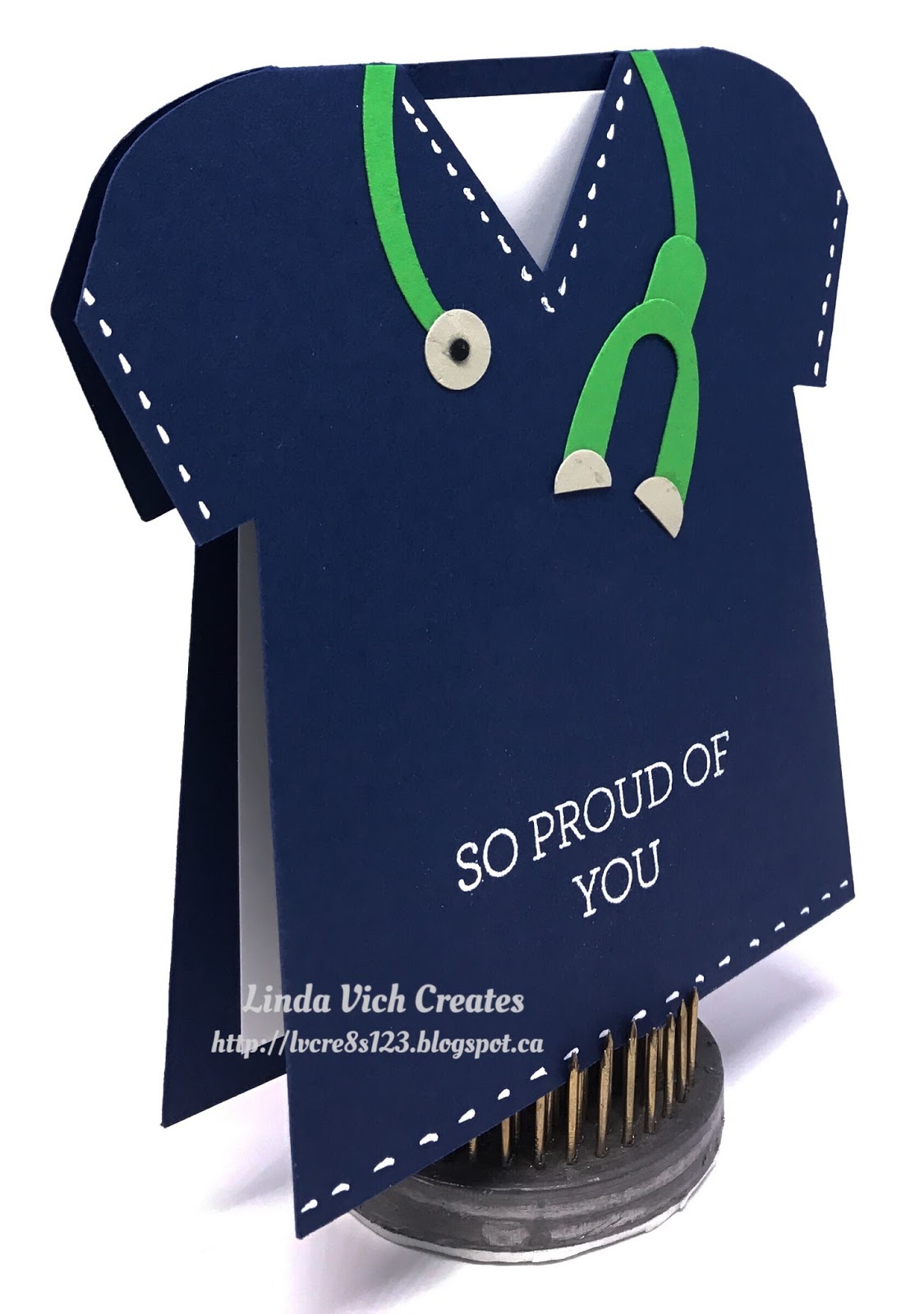
It's Official! My Daughter is a LPN!

Linda Vich Creates: It's Official! My Daughter is a LPN! Nurse scrub top card created with punches and assorted card stock scraps.
My daughter Courtney received notification that she passed the exam for her nursing so she is now officially a LPN! I wanted to mark the occasion so I made her a fitting card.

I purchased a template/tutorial from Lynn Pratt for this card. After receiving the tutorial, I imported the design into my Silhouette Cameo designs so that I could resize it and cut it out.

The card was cut from Night of Navy and stitching lines were added with a Sanford-Sharpie Extra Fine Point Poster Paint Marker. I find this works much better than a gel pen.

I created her stethoscope in green to match her real life stethoscope. It was created by using an assortment of punches–oval, word window and the Itty Bitty Shapes Punch Pack. Scraps of card stock were used to create her stethoscope: Cucumber Crush, Sahara Sand, Basic Black.

The sentiment from the Crazy About You stamp set was stamped with Versamark and heat embossed with White Stampin' Emboss Powder. A Whisper White matte was adhered inside the card.

Linda Vich Creates: It's Official! My Daughter is a LPN! Nurse scrub top card created with punches and assorted card stock scraps.

Linda Vich Creates: It's Official! My Daughter is a LPN! Nurse scrub top card created with punches and assorted card stock scraps.

So proud of our daughter! She is loving being a nurse.


Sunday, June 18, 2017

Seaside Shore Father's Day

Linda Vich Creates: Seaside Shore Father's Day. Both Seaside Shore and Magical Mermaid have been used to create this tropical scene on a Father's Day card.
I had so much fun creating this card for my husband for Father's Day! I really enjoy sponging–especially on watercolor paper which is more forgiving–to get a beautiful blend of colors.

For this card, I started by stamping the two plants using Pear Pizzazz. The plant on the right is from the Seaside Shore stamp set and the other is from Magical Mermaid. I then used my Stampin' Write Markers to color them in and then heat set them.

Next, I did my sponging on a Watercolor paper matte. I used Sahara Sand at the bottom and for the water I used Pool Party, Bermuda Bay, and Island Indigo, sponging right over the plants.

Using Soft Suede, I stamped the little collection of shells and debris on the sandy bottom.

The fish were stamped on watercolor paper as well, using Basic Black Archival. I heat set the ink and then colored them with the markers. After heat setting again, I stamped them with Versamark and heat embossed them with Clear Stampin' Emboss Powder, doing half at a time. I repeated this to make them extra glossy and then even added a touch of Clear Wink of Stella.

On another piece of Watercolor paper I repeated my sponging and then, using my MISTI, I stamped the sentiment from the Crazy About You stamp set using Basic Black and then Versamark which allowed me to heat emboss it with Clear Stampin' Emboss Powder. I then die cut the sentiment using the #3 oval die from the Stitched Shapes Framelits.

The finished sponged matte was adhered to a thin Island Indigo matte using Fast Fuse and then to a Bermuda Bay card front using Dimensionals. The fish and the sentiment were adhered using Dimensionals. I adhered some Papertrey Ink Rainstones for bubbles using liquid adhesive.

I also used watercolor paper for a matte inside the card. I sponged on some Sahara Sand at the bottom and stamped on the shells using Soft Suede. I had planned to just sponge the top and side edges of the card next but forgot and sponged all the way across the top with Pool Party so I went with it! I added Bermuda Bay and Island Indigo at the sides. The sentiment was stamped with Soft Suede.

Linda Vich Creates: Seaside Shore Father's Day. Both Seaside Shore and Magical Mermaid have been used to create this tropical scene on a Father's Day card.

Linda Vich Creates: Seaside Shore Father's Day. Both Seaside Shore and Magical Mermaid have been used to create this tropical scene on a Father's Day card.

Linda Vich Creates: Seaside Shore Father's Day. Both Seaside Shore and Magical Mermaid have been used to create this tropical scene on a Father's Day card.

I'm pleased with the way this turned out–what's not to love with these tropical colors?


Monday, May 29, 2017

Nailed It Workbench Birthday

Linda Vich Creates: Nailed It Workbench Birthday. Detailed workbench card created using the new Wood Textures DSP and the Nailed It Bundle.
Luckily, after a rather late night at my 2017 Catalog Launch Party on Friday, I did not have to work on Saturday. It gave me the day to create a birthday card for our neighbor, Rob.

I had recently viewed some masculine cards on Pinterest and was drawn to the cards using the retiring Nailed It Bundle. After finding a tutorial from Ink Responsibly I decided to create a workbench card. Please refer to her Youtube tutorial for the "ins and outs" of making this card. The card design itself can be adapted to making a dressing table, a kitchen or even a barbecue!

Though the card design was supposed to fold flat for mailing, after I finished the card, mine didn't want to fold! Luckily, my card was able to be "walked" over to my neighbor so I wasn't too concerned!

The basic construction of the card was done with Chocolate Chip card stock and then I cut pieces of the new Wood Textures DSP to adhere over the card stock. Each piece of the DSP was edged with a Chocolate Chip Stampin' Write Marker to cover up the white cut edges as well as being sponged with Chocolate Chip ink.

For the back board of the workbench, I used a Paper Piercer to punch holes in the DSP and then made the holes stand out more by touching up each of them with the Chocolate Chip Marker.

The sign was stamped with Basic Black ink using the Crazy About You stamp set and then punched using the retired Washi Label Punch. Retired Gold Brads were used to attach a piece of the retired Halloween Night Baker's Twine and to hang it on the wall.

The tools were stamped with Stazon ink on both the Silver Foil and Wood Textures DSP and then die cut using the Build It Framelits. The handles were adhered on top of the Silver Foil. The tools were adhered to the workbench using Glue Dots.

To make the drawers, Wood Textures DSP was adhered to pieces of card stock and adhered to the bench using Dimensionals. The gold brads were used for the drawer pulls.

A piece of the retired Going Places DSP that featured blueprints was rolled up and adhered to the bench using Glue Dots. I got the idea of using blueprints from Pauline Barnfather who created another workbench.

One other detail that I added was a book about decks. To create this, I found a book on Amazon and copied the photo into Photoshop where I resized it properly for printing. I glued it to a piece of Chocolate Chip card stock and cut another piece for the back cover. I then cut several "pages" from Thick Whisper White and glued them between the two covers, ensuring that the pages and covers were flush on the left side to create a "spine." I used the Chocolate Chip Marker to color the spine.

For the back of the bench I stamped the sentiment and saw on Very Vanilla with Basic Black and then sponged the edges with both Soft Suede and Chocolate Chip.

Linda Vich Creates: Nailed It Workbench Birthday. Detailed workbench card created using the new Wood Textures DSP and the Nailed It Bundle.

Linda Vich Creates: Nailed It Workbench Birthday. Detailed workbench card created using the new Wood Textures DSP and the Nailed It Bundle.

Linda Vich Creates: Nailed It Workbench Birthday. Detailed workbench card created using the new Wood Textures DSP and the Nailed It Bundle.

Linda Vich Creates: Nailed It Workbench Birthday. Detailed workbench card created using the new Wood Textures DSP and the Nailed It Bundle.

Linda Vich Creates: Nailed It Workbench Birthday. Detailed workbench card created using the new Wood Textures DSP and the Nailed It Bundle.

Linda Vich Creates: Nailed It Workbench Birthday. Detailed workbench card created using the new Wood Textures DSP and the Nailed It Bundle.


This card was a labor of love and I know that Rob loved and appreciated it!

I hope you have enjoyed reading about this card. I'd love for you to leave a comment for me below to let me know you've stopped by to have a look!


Friday, July 1, 2016

Pop of Paradise For My Daughter

Linda Vich Creates: Pop of Paradise For My Daughter. An inked and embossed brick matte serves as the backdrop for this stunning Pop of Paradise flamingo card.
I couldn't wait to begin my summer holidays, on Canada Day, by designing a card for my daughter Courtney.

Courtney has just finished her first year of a two year course to become a Licensed Practical Nurse. Her course is actually four years compressed into two and she has been working very hard to maintain her "A" grades which is no small feat considering she and her boyfriend are also raising their own soon to be three-year-old daughter!

For Courtney's final practicum of the year, she was placed in a care home in the south end of Winnipeg. When she learned of her placement, she was a little nervous about accidentally doing something wrong there because the home was for Jewish patients and there were strict rules about not bringing any food or water into the facility unless it was kosher.

She was also worried that she might inadvertently offend a patient by doing procedures, etc. that might conflict with their beliefs.

As it turned out, the staff at the care home were completely impressed with her and could not stop telling her how well she was doing and that they had never had a student like her before!

Just before she finished her practicum, the Director of Care took Courtney aside to tell her how impressed she was with her and offered her a summer job! Unfortunately, Courtney was unable to take it because she had to look after her own daughter during the summer (as well as preparing assignments ahead of starting classes in September so she could then concentrate on studying for tests) while her daughter's daycare provider took holidays.

When Courtney explained this to the Director of Care, she was told to return after she completed her nurse training because they would offer her a job at that time! Of the group of students that did their practicum at the same care home, she was the only one who was offered a job!

We are so very proud of her so I wanted to create a special card for her.

Choosing my Brick Wall Embossing Folder, I inked up the top flap with Melon Mambo using my now retired Brayer. I did this in order to create pink grout lines between the bricks.

I carefully placed a matte of Thick Whisper White card stock on the opposite flap of the folder and closed the folder. I ran it through my Big Shot and then carefully removed the embossed and inked matte to work with it.

Oh oh . . . I'd done it again! I was making a vertical card but needed the bricks in a horizontal format. Unfortunately, I had not placed the matte in the folder correctly. So, what to do? I used this first matte as my test piece for coloring the bricks!

I used Sponge Daubers with Smoky Slate, Basic Gray, Basic Black and Melon Mambo to color the bricks. At the end, I used a Stampin' Sponge to sponge softly around the whole matte with Basic Black. I was quite pleased with how the bricks turned out!

Linda Vich Creates: Pop of Paradise For My Daughter. An inked and embossed brick matte serves as the backdrop for this stunning Pop of Paradise flamingo card.
Love the color I achieved on the bricks but too bad the
bricks were the wrong orientation for my card!
After inking/embossing another matte, I set forth to color bricks again. So what happens this time? I liked the first matte better! Oh well! I'll use the first matte in a future project.

I used my MISTI to stamp the flamingo from the Pop of Paradise stamp set in Melon Mambo on Thick Whisper White card stock. Next, I used a tip learned from fellow demonstrator, Bibi Cameron in a video on her site. I cleaned the stamp without moving it and then took a Rose Red Stampin' Write Marker and added color to the stamp on the wing, neck, body, and legs to provide shadowing.

I also used the Basic Black marker to color the end of the flamingo's beak to make it look like a real flamingo. The MISTI ensured that I was able to stamp successfully in the exact same place each time.

Linda Vich Creates: Pop of Paradise For My Daughter. An inked and embossed brick matte serves as the backdrop for this stunning Pop of Paradise flamingo card.

I then used Versamark to stamp three leaves and heat embossed them using Silver Stampin' Emboss Powder. And then came the fun part–fussy cutting the flamingo and leaves. Not so fun but effective! I applied liquid glue to the bottom of the leaves and adhered them to the matte.

The Layering Circles Framelits were used to cut a Melon Mambo scalloped matte and a plain circular matte from Silver Glimmer Paper. These were glued together with liquid glue.

Thick Melon Mambo Baker's Twine was wrapped around the matte and taped to the back. Glue dots were used to adhere a circular arrangement made from the now retired Silver Cording Trim. The circle mattes were adhered on top of this using Dimensionals and the flamingo adhered on top, also with Dimensionals.

The sentiment from the Crazy About You stamp set was stamped in Versamark on Basic Black card stock and heat embossed with White Stampin' Emboss Powder. The ends of the strip were flagged using the Banner Triple Punch. The strip was attached to the bottom of the matte with Dimensionals.
The finished brick matte was adhered with Dimensionals to a Melon Mambo matte, and then that to the front of a Basic Black card base.

I stamped with Melon Mambo on a Whisper White matte using the grunge stamp from the Touches of Texture stamp set. The sentiment was stamped with Basic Black to complete the card.

Linda Vich Creates: Pop of Paradise For My Daughter. An inked and embossed brick matte serves as the backdrop for this stunning Pop of Paradise flamingo card.

Linda Vich Creates: Pop of Paradise For My Daughter. An inked and embossed brick matte serves as the backdrop for this stunning Pop of Paradise flamingo card.

Linda Vich Creates: Pop of Paradise For My Daughter. An inked and embossed brick matte serves as the backdrop for this stunning Pop of Paradise flamingo card.

I am so very pleased with how this card turned out and can't wait to give it to my daughter!


Wednesday, June 15, 2016

Jar of Love For Father's Day

Linda Vich Creates: Jar of Love For Father's Day. Sparkling fireflies frolic in a mason jar on this Night of Navy and Floral Boutique matted card.
I have so many new products from the new catalog that it is hard to choose what to play with next!

When I sat down to craft today, I had planned to make a Father's Day card for my husband. I was prepared to use the Best Birds stamp set and was going to watercolor one of the birds. Much to my annoyance, I discovered that once you use rubbing alcohol in a water brush pen (I use the Kuretake Fude Water Brush Pen, Small because I like the detailed tip better than on the Stampin' Up Aqua Pen) it should only be reserved for alcohol as the alcohol.

It seems that somehow the alcohol gets trapped in the end and it didn't seem to work properly for water after that! So, I have another one on order (that will be marked for water only!) but it won't arrive until Friday.

Shifting gears, I decided to work with the Jar of Love stamp set instead. Because I was drawn to the "You Light Up My Life" sentiment, I decided to put fireflies in a jar.

I used my MISTI to stamp the largest jar on a piece of Window Sheet using Jet Black Stazon. I set it aside to dry while I stamped the fireflies on vellum and heat embossed them with the now retired Black Stampin' Emboss Powder. I also stamped the lid for the jar on Thick Whisper White card stock using Versamark and heat embossed it with Silver Stampin' Emboss Powder.

I used the Everyday Jars Framelits to die cut the jar, lid, and fireflies. Before die cutting the fireflies, I used a Crushed Curry Stampin' Write Marker to color on the backside of the vellum. Afterwards, I decided that the "light" wasn't bright enough so then I colored on the front side of the vellum.

On a small Night of Navy matte, I stamped the sentiment in Versamark and heat embossed it with White Stampin' Emboss Powder. I attached the lid to the jar using glue dots and then adhered the jar to the matte using Dimensionals just under the lid. I was able to position and adhere the fireflies under the jar by lifting it up.

The Night of Navy matte was adhered to a Thick Whisper White matte using Fast Fuse. A matte cut from a sheet of the Floral Boutique DSP (you have to get this–it's wonderful!) was adhered to another Night of Navy matte with Fast Fuse and then the matte with the jar was adhered to the larger matte with Dimensionals. This entire matted piece was then adhered to a Thick White card base using Dimensionals.

After it was put together I liked it but still didn't like the "light" from the fireflies. I decided to use a Y18 Copic Marker to color some rhinestones and stuck these to the fireflies. Finally, they had lights I could appreciate!

The inside of the card was plain except for a Happy Father's Day sentiment from the Crazy About You stamp set.

Linda Vich Creates: Jar of Love For Father's Day. Sparkling fireflies frolic in a mason jar on this Night of Navy and Floral Boutique matted card.

I'm pleased with how my card turned out and I am sure my husband will like it. The crisp navy and white really look nice together! If I could change only one thing, I wish that I had stamped the jar in White Stazon instead of the black because I think it would have shown up better.


Wednesday, June 1, 2016

Catalog Party Prep Part 2


The 2016-2017 Stampin' Up! Catalog is LIVE! You are all set to view it here and place your orders! It is a wonderful catalog, all 204 pages for you to explore!

Plus, for the month of June, when your order totals $400 before taxes and shipping, you will receive $40 more in Stampin' Rewards! Start making your list!

host-promo-header-NA


Today's post is Part 2 in my 5-part series. You can read Part 1 here. This lovely card set was CASEd from Stamper's Blog.

Linda Vich Creates: Catalog Party Prep Part 2. This set of In Color cards is all about lines, from the die cut border to the intricate lines of the inset butterflies.

A standard card base was cut from Thick Whisper White and then mattes in each of the five In Colors was cut 4.25 x 5.5". The now retired Adorning Accents Edgelits were used to trim a curved bottom into each matte.

The Butterflies Thinlits were used to cut a butterfly from the top of each matte and then the mattes were adhered to the front of each card base using Fast Fuse Adhesive. Each butterfly was coated with Wink of Stella and then Multi Medium Matte was used to glue each butterfly back into the opening in each matte.

The sentiment from the Crazy About You stamp set was stamped at the bottom of each card base in ink matching the matte to complete the cards.

Linda Vich Creates: Catalog Party Prep Part 2. This set of In Color cards is all about lines, from the die cut border to the intricate lines of the inset butterflies.

Linda Vich Creates: Catalog Party Prep Part 2. This set of In Color cards is all about lines, from the die cut border to the intricate lines of the inset butterflies.

Linda Vich Creates: Catalog Party Prep Part 2. This set of In Color cards is all about lines, from the die cut border to the intricate lines of the inset butterflies.

Linda Vich Creates: Catalog Party Prep Part 2. This set of In Color cards is all about lines, from the die cut border to the intricate lines of the inset butterflies.

Linda Vich Creates: Catalog Party Prep Part 2. This set of In Color cards is all about lines, from the die cut border to the intricate lines of the inset butterflies.

These cards are simple yet effective because they use only two colors that give good contrast and because the focus is only on lines!


Wednesday, March 9, 2016

Birthday Blooms and Botanicals Meet Shabby Chic

Time to change things up a bit by combining some watercoloring with a shabby chic style!

Today's design of this early Mother's Day card resulted from my color choice for watercoloring the lovely Birthday Blooms stamp. I have seen a lot of variations of this flower being colored but not too many yellow ones. I decided that I would use a different yellow hue for the flower by combining So Saffron and Delightful Dijon for a rich, dark yellow hue.

I started by stamping on watercolor paper with Basic Black Archival ink. I used my MISTI so I was then able to stamp in Versamark which allowed me to heat emboss using Clear Stampin' Emboss Powder.

Using my Aqua Painter, I wet a few sections of the stamp at a time and then colored the sections with So Saffron reinker. I used my heat tool to dry my work and then added in some shadowed areas using the Delightful Dijon reinker.

For the centre of the flower I used Soft Suede reinker. For the leaves, I used Old Olive and after drying, Mossy Meadow for the shadows.After completely drying the my work, I fussy cut the flower.

Next, I cut two ovals, Hello Honey and Mossy Meadow, from papers in the Botanical Gardens DSP. I used a Distress Tool to distress the edges of each. I sponged the edges with Delightful Dijon and Cajun Craze. These were adhered using Dimensionals. The flower was also adhered in the same way.

I cut a card base for a 6 x 4.75" card from Delightful Dijon. After scoring and folding, I distressed the edges and sponged them and the top of the card with Delightful Dijon. I cut a flowered matte from the Botanical Gardens DSP and distressed its edge and inked it with Cajun Craze. I wrapped two layers of the Delightful Dijon 1" Ribbon around the matte (two layers to make the color deeper) and taped the ends on the back. The matte was adhered to the card base using Fast Fuse Adhesive.

I adhered a small strip of paper to the middle of the ribbon and put Fast Fuse Adhesive on it. I layered some Lost Lagoon Thick Twine, from the now retired In Colors Accessory Pack, over the adhesive to accentuate the tiny flowers on the paper. The oval mattes were then adhered over top with Dimensionals.

I used the banner die from the Large Numbers Framelits Dies to die cut a piece of Cajun Craze patterned paper from the Botanical Gardens DSP and another from Cajun Craze card stock. I stamped the sentiment from the Crazy About You Stamp Set on the patterned paper with Basic Black Archival ink and stamped again with Versamark. I heat embossed with Clear Stampin' Emboss Powder and then layered the patterned paper sentiment on top of the Cajun Craze card stock for stability. This was adhered to the card front with Dimensionals.

Inside the card, I cut a matte from the same flowered DSP. I cut a smaller matte from the now retired Naturals White card stock. I distressed both mattes, inking the edges with Cajun Craze and Delightful Dijon. I stamped the sentiment from the First Sight Stamp Set in Mossy Meadow. The mattes were layered and adhered inside the card with Fast Fuse Adhesive.


I really like the shabbiness and the rich hues in this card!

Have you tried the Shabby Chic style? Let me know in the comments below!


Tuesday, March 8, 2016

Botanical Wedding Card

It happened again the other day.

I was at work at Walmart, waiting on another customer, when I spotted a new magazine in the rack. I quickly recognized the colors of Blushing Bride and Very Vanilla, on a background of green and a card idea started bubbling on the fringes of my mind! Here's the magazine cover that sparked my creative juices:


My vision for this card was that of a bride's bouquet, complete with ribbons and pearls on a lovely green background. To be able to fit in both the bouquet and ribbons, I chose a 5 x 7" format for my card.

I cut a matte that was 4.75 x 6.5" so that it would fit within the embossing folder I wished to use–Craft Concepts Tuscan Tiles. After embossing, I used Garden Green ink with a sponge to color the raised portions of the embossing. I adhered the matte to a 5 x 7" Cucumber Crush card base.

Next, I chose a circle die from the Circles Collection Framelits Dies and used that as a frame to create my bouquet simply by laying it on top of my embossed matte and adding flowers within it.

Using the Botanical Builders Framelits Dies, I cut flowers from Blushing Bride and Pink Pirouette as well as a couple of centres from the Blushing Bride Glimmer Paper. I also punched flowers using one of the punches from the Itty Bitty Accents Punch Pack and one from the now retired Itty Bitty Shapes Punch Pack. I inked the edges of the pink flowers with Strawberry Slush and the Blushing Bride ones with Calypso Coral. I also shaped them using the McGill Paper Blossom Tool Kit.

I assembled the few flowers that needed centres and then started adding flowers to the circle die on my card front. I started by adding the largest flowers, filled in with the next largest small flowers and finally the smallest flowers. Once I was happy with the design, I snapped a photo for reference and then removed all but the largest flowers.

Circle die used to arrange the blossoms in a circle.

One by one, I used Multi Medium Matte to adhere each flower to the card front. Once I had filled up the circle, I removed the die and then added pearls to the centre of each blossom.

I used Glue Dots to adhere a bow of Pink Pirouette Seam Binding and a length of Blushing Bride Sequin Trim beneath the bouquet.

On vellum card stock I stamped the sentiment in Calypso Coral using the MISTI and both the Crazy About You and the Number of Years Stamp Sets. I also stamped in Versamark and then heat embossed with Clear Stampin' Emboss Powder. I die cut the sentiment using a die from the Large Numbers Framelits Dies. I placed two pearls on the front of the sentiment and then positioned glue dots below them on the opposite side to adhere the banner to the card front.

For the inside of the card, I cut a matte from the now retired Naturals White card stock. I used Cucumber Crush to stamp the sentiment from the Beautiful Ride Stamp Set and added some flowers from the Bloomin' Love Stamp Set using Calypso Coral. I added the couple stamp in Blushing Bride to the bottom of the card. I inked the edges with Blushing Bride and then adhered the matte with Fast Fuse to complete the card.


Close up details.


I love the richness created by the embossing and sponging on the card front and the flowers looks so nice on top of it!

Let me know what you think by dropping me a comment below!


Saturday, February 20, 2016

Timeless Textures Thank You

Those of you who know me well, or at least follow my blog, know that I love texture. Because of this, I was immediately drawn to this card by Dena Rekow.

Dena's card employs texture in a few ways:

  1. By using a patterned paper
  2. By stamping with ink with the Timeless Textures Stamp Set
  3. By stamping with water
Yes, you read that right! Stamping with water is a really neat technique that produces texture by subtracting color! But I'm getting ahead of myself.

I decided to CASE Dena's card but change up the colors and use it for thank you cards for my stamping group.

I started by cutting a standard card base from Basic Black. I cut a skinny Island Indigo matte and finally a matte from a piece of the Typeset DSP.

I used Island Indigo with the mottled edge stamp from Timeless Textures to stamp around the outside of the matte. I then used another of the stamps to stamp a couple of times with Basic Black Archival ink on the matte itself.

I cut a tag for the card from Whisper White by using a die from the Lots of Labels Framelits Dies. I used a sponge dauber to color the entire tag with Bermuda Bay ink and then covered it again using Island Indigo ink. Using the swirly stamp from Timeless Textures, I spritzed it 4-5 times with my Mini Mister (until water beaded on the stamp). I then stamped it onto the paper and held it there for about 10 seconds.

What was left was a very light swirl stamp that deepened as it dried. I stamped it a second time and then made sure it was totally dry by zapping it with my Heat Tool. I then stamped the sentiment from the Crazy About You Stamp Set using Basic Black Archival ink.

I adhered the stamped matte to the Island Indigo matte using Snail Adhesive. A length of the 3/8" Basic Black Stitched Ribbon was knotted around the matte. This was then adhered with Dimensionals to the Basic Black card front.

The edges of the tag were inked with Basic Black Archival ink and then it was adhered with Dimensionals to the card front.

A matte of Whisper White was cut for the inside. (This is where I made an error but it was too late to correct. I should have used a Very Vanilla matte for the inside because the Typeset Paper has a Very Vanilla background rather than one that is white.) I inked the edges with the same stamp as on the front of the card and stamped one swirl stamp. The matte was adhered with Fast Fuse Adhesive to complete the card.


What is important to note about this card technique is that Clear Mount stamps were used. I'm not sure if Photopolymer stamps would work as well for this technique. In addition the stamps were "distressed" stamps so that weird effects from the water would be acceptable.

I will definitely use this technique again and I will try it with Photopolymer stamps to see if my hypothesis is valid. I'm thinking that the Awesomely Artistic Stamp Set might be a good one to try. The First Sight Stamp Set would also be another possibility. Even Kinda Eclectic could produce some neat results! It will be fun to experiment to see what works best!

I hope you try the water stamping technique–let me know how it works for you!


Saturday, May 2, 2015

Revving Up For Retirement

I had a slight mishap on Thursday that kept me home from work but luckily I was feeling much better on Friday so that I could continue as planned with my stamping group. To find out what happened, check out my Facebook post here.

My stamping ladies were busy last night, creating cards using products that are on the retiring list. It was good to work with these favorite products before they disappear!

Linda Vich Creates: Revving Up For RetirementLinda Vich Creates: Revving Up For Retirement

Our first card was a departure from my usual colors and style but I wanted to create something that had a vintage feel to it.

Linda Vich Creates: Revving Up For Retirement. Vintage look is achieved with the use of neutral inks and embellishments in this Petal Potpourri card.


To begin with, we distressed a Whisper White matte and a smaller piece of the same using a sponge and the retiring Baked Brown Sugar ink.

Next, MISTI came into play when we used the retiring Dictionary background stamp with Soft Suede ink. It was stamped off once and then gave a nice hint of text to the distressed matte. To further distress it, the Distressing tool was used and then the edges were inked with Soft Suede.

We used the retiring On Film Framelits to cut a frame from Watercolor paper and then sponged it with Early Espresso. We used the frame to determine where to stamp the two flowers from the Petal Potpourri stamp set.

Two flowers were stamped on the matte using Baked Brown Sugar and one was stamped on the smaller distressed piece, using Soft Suede. The centre of that flower was colored with Hello Honey using a sponge dauber and the flower was punched with the Flower Medallion punch. Its edges were then inked with Soft Suede.

A strip of Sahara Sand Lace and the previously retired Soft Suede Taffeta ribbon were adhered to the bottom of the matte and then it was adhered to a Soft Suede card base using Dimensionals.
The frame was adhered to the matte with glue dots and then the punched flower was adhered inside but overlapping the frame using doubled-up Dimensionals.

The Hello You thinlits were used to die cut the word "you" and the banner punch was used to cut two banners from Dazzling Diamonds Glimmer paper. These were each sponged with Baked Brown Sugar and the banners were edged with Soft Suede.

"You" was adhered with glue to the top of the card. The banners were angled and adhered to the bottom right of the frame. A dragonfly bead was painted with Tim Holtz Tarnished Brass Distress Paint and then adhered on top of the banners using Crystal Effects.

The sentiment, Amaze Me, from the Crazy About You stamp set, was stamped with Early Espresso at the bottom of the card base.

To complete the card, an inside matte was created from a piece of the retiring Naturals White card stock. A flower was stamped in the bottom right corner using Soft Suede and then the edges were inked with Baked Brown Sugar.

Linda Vich Creates: Revving Up For Retirement. Vintage look is achieved with the use of neutral inks and embellishments in this Petal Potpourri card.

Linda Vich Creates: Revving Up For Retirement. Vintage look is achieved with the use of neutral inks and embellishments in this Petal Potpourri card.


Built for Free Using: My Stampin Blog


Inspiration for a Mother's Day card came from a creation by the Stampin' Stud.

We used a card base of Calypso Coral. A matte of the retiring Strawberry Slush was embossed with the Spring Flowers Embossing Folder and the edges inked with Calypso Coral. It was adhered to the card base with Dimensionals.

Linda Vich Creates: Revving Up For Retirement. A Mother's Day card is embellished with sponged vellum flowers and adorned with Gold Glimmer leaves.

A strip of Irresistably Yours was sponged with gold ink, heat set, and then the white leaves brought back by rubbing with paper towel.

The 1 3/4" and the 1 1/4" Scallop Circle Punches were used to punch circles from Gold Glimmer and Calypso Coral papers. The smaller circle's edges were inked with Strawberry Slush. The circles were then layered onto a 1/4 of a Tea Doily and adhered under the strip of leafy resist paper.

A square of vellum was sponged with a combination of Hello Honey, Pumpkin Pie, Strawberry Slush, and Blackberry Bliss. The Fun Flower punch was used twice, the Pansy Punch once and the Petite Petal Punch was used once.

The punched flowers were crumpled gently to give them some dimension and then a piercing tool was used to poke a hole in the centre of each. They were then attached together with a Candy Base Brad. A rhinestone which had been colored with a R24 Copic marker was added to the brad.

Glue dots were used to secure a length of Gold Baker's Twine in a pleasing circular arrangement and then the completed flower was adhered with Dimensionals on the left side of the leafy strip. The retired Secret Garden Framelits were used to die cut some leaves from Gold Glimmer paper and they were tucked under the flower and adhered with glue.

For the inside of the card, a matte of the retiring Naturals Ivory had its edges inked with gold and then the flowers and sentiment from the Mother's Love stamp set were stamped using Strawberry Slush and Crisp Cantaloupe, respectively.

Linda Vich Creates: Revving Up For Retirement. A Mother's Day card is embellished with sponged vellum flowers and adorned with Gold Glimmer leaves.

Linda Vich Creates: Revving Up For Retirement. A Mother's Day card is embellished with sponged vellum flowers and adorned with Gold Glimmer leaves.


Built for Free Using: My Stampin Blog


Lots of inky hands at the end of the night but some lovely cards were produced and a good time was had by all! Though it will be sad to see the products we used retire, the space they leave behind will be filled with more great products with which to create!

What products will you be sad to see retire? Leave me a comment below!