Wednesday, May 31, 2017

Colorful Seasons in Berry Burst

Linda Vich Creates: Colorful Seasons in Berry Burst. Vibrant Berry Burst takes centre stage in this card that uses the Color Theory DSP and displays an Adirondack chair as a focal point.
With only two sleeps until the 2017 Catalog goes live, I was itching to use some of the products from my demonstrator Pre-order today!

With Berry Burst as my new favorite In Color, I chose a sheet of paper from the Color Theory DSP and some Berry Burst card stock. I cut a standard card base from the card stock and cut a matte from the DSP.

From another piece of the card stock I die cut the Adirondack chair using the Seasonal Layers Thinlits. After die cutting a piece of Thick Whisper White using a square from the Stitched Shapes Framelits and a square of Basic Black using the Layering Squares, I adhered the chair to the Whisper White using liquid adhesive and then adhered that to the Basic Black square.

The sentiment from the Colorful Seasons stamp set was stamped in Basic Black at the bottom of the DSP matte. I then decided to use a thin Basic Black matte under the DSP matte and adhered the two together.

I wrapped a length of Basic Black Baker's Twine around the matte and then adhered the square with the chair on top using Dimensionals. The large matte was then adhered to the card front using Dimensionals.

For inside the card, I adhered a Whisper White matte. After die cutting a branch from Early Espresso, I used liquid adhesive to adhere it to the bottom of the matte. Using Berry Burst ink, I stamped the three flowers on Whisper White and then die cut them. They were adhered to the branch using Glue Dots to complete the card.

Linda Vich Creates: Colorful Seasons in Berry Burst. Vibrant Berry Burst takes centre stage in this card that uses the Color Theory DSP and displays an Adirondack chair as a focal point.

Linda Vich Creates: Colorful Seasons in Berry Burst. Vibrant Berry Burst takes centre stage in this card that uses the Color Theory DSP and displays an Adirondack chair as a focal point.

Linda Vich Creates: Colorful Seasons in Berry Burst. Vibrant Berry Burst takes centre stage in this card that uses the Color Theory DSP and displays an Adirondack chair as a focal point.

Linda Vich Creates: Colorful Seasons in Berry Burst. Vibrant Berry Burst takes centre stage in this card that uses the Color Theory DSP and displays an Adirondack chair as a focal point.

I hope you have enjoyed this blog post! Why not leave me a comment to let me know you stopped by?


Tuesday, May 30, 2017

2017 Catalog Launch Prep Part 1: Third Prize

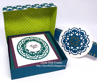
Linda Vich Creates: 2017 Catalog Launch Prep Part 1: Third Prize. Box of five note cards using the 2017-2019 In Colors and Eastern Palace Suite.
When starting my preparations for my 2017 Catalog Launch, I knew that I wanted to showcase the new 2017-2019 In Colors. To do that, I decided to use the Eastern Palace Bundle.

I made five, four inch card bases by cutting one from each color–Powder Pink, Fresh Fig, Berry Burst, Lemon Lime Twist and Tranquil Tide.

Using the Eastern Medallions #3 and #2 together, I cut out medallions from each of the five colors and then used the #8 Scalloped Circle from the Layering Circles to fully cut them from the colors. I cut mattes from Whisper White and used liquid adhesive to adhere each medallion to a matte.

On Thick Whisper White, I stamped the sentiment in each of the five colors and then die cut them using the #1 stitched circle from the Stitched Shapes Framelits. These were adhered to the centres of the medallions using Dimensionals. These mattes were then adhered to the card bases using Fast Fuse.

Whisper White mattes were cut for the inside of the cards and they were sponged with each of the five colors and then adhered inside the cards.

In assembling the cards, the colors were contrasted on the cards so that the sentiments matched the card bases and the inside sponging matched the medallions. These colors worked so nicely together!

To contain the cards, I used the 1/16" rule of box making via Catherine Pooler. The box bottom was made from Dapper Denim card stock and the top from a sheet of the exquisite Eastern Palace Specialty DSP! I used a circle punch to punch half circles in each side to make it easier to open.

I used a strip of the beautiful foiled paper with a strip of Dapper Denim on top to create a belly band for the box. Since the strips were not long enough, I adhered them to Thick Very Vanilla die cut with the #8 circle from the Layering Circles and then adhered a larger circle of card stock on top of it, cut with the #7 circle from the now retired Circles Collection Framelits.

Linda Vich Creates: 2017 Catalog Launch Prep Part 1: Numbering on retired Circles Collection Framelits.

A medallion was cut from Dapper Denim using the #2, #3, and #4 dies. Layering Circle #1 was used to die cut a piece of Gold Foil which was adhered behind the medallion. The completed medallion was adhered on top of the large Very Vanilla Circle to complete the box.

Linda Vich Creates: 2017 Catalog Launch Prep Part 1: Third Prize. Box of five note cards using the 2017-2019 In Colors and Eastern Palace Suite.

Linda Vich Creates: 2017 Catalog Launch Prep Part 1: Third Prize. Box of five note cards using the 2017-2019 In Colors and Eastern Palace Suite.

Linda Vich Creates: 2017 Catalog Launch Prep Part 1: Third Prize. Box of five note cards using the 2017-2019 In Colors and Eastern Palace Suite.

Linda Vich Creates: 2017 Catalog Launch Prep Part 1: Third Prize. Box of five note cards using the 2017-2019 In Colors and Eastern Palace Suite.

Linda Vich Creates: 2017 Catalog Launch Prep Part 1: Third Prize. Box of five note cards using the 2017-2019 In Colors and Eastern Palace Suite.

Linda Vich Creates: 2017 Catalog Launch Prep Part 1: Third Prize. Box of five note cards using the 2017-2019 In Colors and Eastern Palace Suite.

Linda Vich Creates: 2017 Catalog Launch Prep Part 1: Third Prize. Box of five note cards using the 2017-2019 In Colors and Eastern Palace Suite.

I think that the box and the cards looked very impressive and I may make a set for myself in the future!


Monday, May 29, 2017

Nailed It Workbench Birthday

Linda Vich Creates: Nailed It Workbench Birthday. Detailed workbench card created using the new Wood Textures DSP and the Nailed It Bundle.
Luckily, after a rather late night at my 2017 Catalog Launch Party on Friday, I did not have to work on Saturday. It gave me the day to create a birthday card for our neighbor, Rob.

I had recently viewed some masculine cards on Pinterest and was drawn to the cards using the retiring Nailed It Bundle. After finding a tutorial from Ink Responsibly I decided to create a workbench card. Please refer to her Youtube tutorial for the "ins and outs" of making this card. The card design itself can be adapted to making a dressing table, a kitchen or even a barbecue!

Though the card design was supposed to fold flat for mailing, after I finished the card, mine didn't want to fold! Luckily, my card was able to be "walked" over to my neighbor so I wasn't too concerned!

The basic construction of the card was done with Chocolate Chip card stock and then I cut pieces of the new Wood Textures DSP to adhere over the card stock. Each piece of the DSP was edged with a Chocolate Chip Stampin' Write Marker to cover up the white cut edges as well as being sponged with Chocolate Chip ink.

For the back board of the workbench, I used a Paper Piercer to punch holes in the DSP and then made the holes stand out more by touching up each of them with the Chocolate Chip Marker.

The sign was stamped with Basic Black ink using the Crazy About You stamp set and then punched using the retired Washi Label Punch. Retired Gold Brads were used to attach a piece of the retired Halloween Night Baker's Twine and to hang it on the wall.

The tools were stamped with Stazon ink on both the Silver Foil and Wood Textures DSP and then die cut using the Build It Framelits. The handles were adhered on top of the Silver Foil. The tools were adhered to the workbench using Glue Dots.

To make the drawers, Wood Textures DSP was adhered to pieces of card stock and adhered to the bench using Dimensionals. The gold brads were used for the drawer pulls.

A piece of the retired Going Places DSP that featured blueprints was rolled up and adhered to the bench using Glue Dots. I got the idea of using blueprints from Pauline Barnfather who created another workbench.

One other detail that I added was a book about decks. To create this, I found a book on Amazon and copied the photo into Photoshop where I resized it properly for printing. I glued it to a piece of Chocolate Chip card stock and cut another piece for the back cover. I then cut several "pages" from Thick Whisper White and glued them between the two covers, ensuring that the pages and covers were flush on the left side to create a "spine." I used the Chocolate Chip Marker to color the spine.

For the back of the bench I stamped the sentiment and saw on Very Vanilla with Basic Black and then sponged the edges with both Soft Suede and Chocolate Chip.

Linda Vich Creates: Nailed It Workbench Birthday. Detailed workbench card created using the new Wood Textures DSP and the Nailed It Bundle.

Linda Vich Creates: Nailed It Workbench Birthday. Detailed workbench card created using the new Wood Textures DSP and the Nailed It Bundle.

Linda Vich Creates: Nailed It Workbench Birthday. Detailed workbench card created using the new Wood Textures DSP and the Nailed It Bundle.

Linda Vich Creates: Nailed It Workbench Birthday. Detailed workbench card created using the new Wood Textures DSP and the Nailed It Bundle.

Linda Vich Creates: Nailed It Workbench Birthday. Detailed workbench card created using the new Wood Textures DSP and the Nailed It Bundle.

Linda Vich Creates: Nailed It Workbench Birthday. Detailed workbench card created using the new Wood Textures DSP and the Nailed It Bundle.


This card was a labor of love and I know that Rob loved and appreciated it!

I hope you have enjoyed reading about this card. I'd love for you to leave a comment for me below to let me know you've stopped by to have a look!


2017 Catalog Launch Party

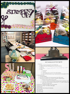
Linda Vich Creates: 2017 Catalog Launch Party. Collaged photo showing decor for catalog launch party.
Woohoo! Friday night was party night for our stamping group as we celebrated the eagerly anticipated, soon to be released new catalog!

Between babysitting, work, and company at our house, I had had little time to prepare let alone create other things and blog about them in the days leading up to the launch. However, I will be sharing a series of blog posts about what I created for the launch later this week.

One of the things that is most fun to plan for the launch is the food and decor. This year my daughter created a wonderful cake for our party, complete with the five new In Colors! Though she was not too happy with her creation, my ladies and I loved it! The cake looked stunning on the food table since the rest of the food I had to purchase rather than make due to time constraints.

After Christmas this year, I was lucky enough to purchase some of the lovely Heidi Swap Marquee Letters at half price. They looked great after I added some of the Pop of Pink DSP to them! Here is a close up of the letters:

Linda Vich Creates: 2017 Catalog Launch Party. Photo showing decor for catalog launch party.


Though the tablecloth had a few extra colors, it did look very festive and showcased shades close to Lemon Lime Twist and Berry Burst. Following the In Colors color scheme–though it can't be seen in the photo–the Door Prize was packaged in a large Lemon Lime Twist colored bowl!

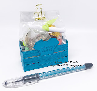
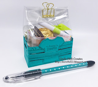
Also prepared as treats for each lady was a Mini Crate–in her favorite Stampin' Up! color. It was created by stamping card stock with the Hardwood stamp and then constructing the crates after die cutting with the Wood Crates Thinlits. The crates were loaded with a Catalog Survival Kit, two un-inked Ink Spots, a door prize draw ticket, and a T-Shirt magnet. These were accompanied by a pen filled with matching DSP.

Linda Vich Creates: 2017 Catalog Launch Party. Mini crates created with the Wood Crate Thinlits Dies and filled with a catalog survival kit and other goodies.

Here are close ups of all eight crates:

Linda Vich Creates: 2017 Catalog Launch Party. Mini crates created with the Wood Crate Thinlits Dies and filled with a catalog survival kit and other goodies.

Linda Vich Creates: 2017 Catalog Launch Party. Mini crates created with the Wood Crate Thinlits Dies and filled with a catalog survival kit and other goodies.

Linda Vich Creates: 2017 Catalog Launch Party. Mini crates created with the Wood Crate Thinlits Dies and filled with a catalog survival kit and other goodies.

Linda Vich Creates: 2017 Catalog Launch Party. Mini crates created with the Wood Crate Thinlits Dies and filled with a catalog survival kit and other goodies.

Linda Vich Creates: 2017 Catalog Launch Party. Mini crates created with the Wood Crate Thinlits Dies and filled with a catalog survival kit and other goodies.

Linda Vich Creates: 2017 Catalog Launch Party. Mini crates created with the Wood Crate Thinlits Dies and filled with a catalog survival kit and other goodies.

Linda Vich Creates: 2017 Catalog Launch Party. Mini crates created with the Wood Crate Thinlits Dies and filled with a catalog survival kit and other goodies.

Linda Vich Creates: 2017 Catalog Launch Party. Mini crates created with the Wood Crate Thinlits Dies and filled with a catalog survival kit and other goodies.

Now for the evening's activities! As you can see from one of the previous photos, I had a full agenda planned for the night!

After a few brief highlights of the new catalog, (it was not brand new to my ladies since all but two had received theirs in the mail earlier) we moved on to some team events.

The ladies drew pieces of ribbon from a bag to determine teams–either Tranquil Tides or Berry Bursts–and this was repeated before each of the three activities.

The first activity was a Catalog Scavenger Hunt where the ladies had to hunt through the catalog for the products shown in cropped catalog photos and write them down on a sheet. They only got 15 minutes to find all 20 items so they had to work quickly!

Following the Scavenger Hunt, and after choosing new teams, the ladies had to work as a group to design a card and then create their individual copies of it as one of their projects for the night. Each group was given the same card stock, patterned paper, ribbon, stamps, stamp pad, and embellishments to use. Brian, our host Carolyn's husband, acted as a judge and decided on which group's design was awarded first or second. Both groups came up with lovely designs!

Linda Vich Creates: 2017 Catalog Launch Party. Cards designed as a group activity.

Linda Vich Creates: 2017 Catalog Launch Party. Cards designed as a group activity.

After a bit of an intermission for refreshments and some of the gorgeous cake, we reassembled for the third activity of the evening. New teams were chosen and the ladies had to decipher clever word clues for 30 of the Stampin' Up! colors within a 15 minute time limit!

Linda Vich Creates: 2017 Catalog Launch Party. Stampers busy completing the three activities for the catalog launch.

Next, they were able to relax after competing on teams and complete their remaining project for the evening.

Linda Vich Creates: 2017 Catalog Launch Party. The 2017-2019 In Colors are featured on this card that uses debossing from the Celebrations Duo Embossing Folders.

A piece of Thick Whisper White was debossed using the Celebrate folder from the Celebrations Duo Embossing Folders. The image was then stamped, using the five 2017-2019 In Colors, with a splotch stamp from the Happy Celebrations stamp set.

The sentiment was stamped with Basic Black ink. The stamped piece was then distressed using the now retired Distressing Tool and then adhered with Fast Fuse to a thin, Tranquil Tide matte.

A piece of the Berry Burst Finely Woven Ribbon was folded and stapled to the top of the matte using the now retired Handheld Stapler. The matte was then adhered to a Lemon Lime Twist card front using Dimensionals. Three sequins were adhered to the card front using Glue Dots.

For inside the card, the larger splotch stamp was stamped with Lemon Lime Twist on a Whisper White matte and then the sentiment was stamped on top using Basic Black. The matte was adhered inside to complete the card.

Linda Vich Creates: 2017 Catalog Launch Party. The 2017-2019 In Colors are featured on this card that uses debossing from the Celebrations Duo Embossing Folders.

Linda Vich Creates: 2017 Catalog Launch Party. The 2017-2019 In Colors are featured on this card that uses debossing from the Celebrations Duo Embossing Folders.

Linda Vich Creates: 2017 Catalog Launch Party. The 2017-2019 In Colors are featured on this card that uses debossing from the Celebrations Duo Embossing Folders.

While the ladies were busy completing their cards, I calculated the final results of our three activities to determine a first, second, and third place winner. Since I only had three prizes, I had to use a special method for determining these rankings.

Prior to the launch, I chose two envelopes–one for First and one for Second. Inside each envelope I placed four playing cards–6, 7, 8, 9 and 2, 3, 4, 5, respectively. With each activity, each team placed either First or Second. I had each team member draw a card from the appropriate envelope and I recorded the number. This was done after each activity. I then tallied the scores for each person to arrive at a First, Second, and Third. In the case of a tie (or ties), I simply had the participants draw a card from the deck with the highest card promoting that lady up a rank.

Prizes for First, Second, and Third were sets of cards and envelopes that I had created. Blog posts will be done for each of these later this week.

Finally, we had the draw for the door prize to complete the evening. Don't these ladies look happy with their prizes?

Linda Vich Creates: 2017 Catalog Launch Party. Happy prize winning ladies!

It was such a fun night but also somewhat bittersweet as some of the ladies will not be able to return for classes in September. We will definitely miss them!

I hope you have enjoyed reading about our 2017 Catalog Launch! If you are in the Winnipeg area and would like to craft with us, please get in touch–we'd love to have you join us!


Tuesday, May 9, 2017

Tri-fold Daisy for Mother's Day With 2017 Catalog Sneak Peeks

Linda Vich Creates: Tri-fold Daisy for Mother's Day With 2017 Catalog Sneak Peeks. Delightful daisies and Wood Textures team up to produce this distinctly feminine tri-fold Mother's Day card.
As soon as I laid eyes on the Delightful Daisy DSP in the 2017-2018 Annual Catalog, I knew I would be using it for my Mother's Day card! There are such lovely colors and patterns in this DSP and they speak to me . . . this is one pack that I definitely will be cutting up to use and I'll probably purchase some more!

My patterned paper was chosen and of course I wanted to use the new Daisy Punch but I still needed to decide on a technique for the card I would make for my mother. After reviewing my pins on Pinterest, I decided to try BJ Peters' Tri-fold Card.

I tried a sample using scrap paper and determined that I wanted a larger format so instead of the standard 4.25 x 5.5" card size, I revamped BJ's design to use my favorite 4.75 x 6" format. This gave me more room to display the lovely daisy DSP and the flower punch seemed to work better with that size of canvas.

Because I love the look of flowers against wood (like in those gorgeous photos of old buildings with wildflowers growing around them) I picked the Wood Textures DSP to complement the flowers.

I started by cutting a piece of Night of Navy card stock to 6 x 11" and then scored on the long side at 2 1/2" and 7 1/4." Mattes for the two front flaps and the inside panel were cut from Calypso Coral as well as a piece of the Wood Textures and a piece of the Daisy Delight DSP for each of the two front flaps. These were adhered using Fast Fuse. A white matte was also cut for the inner panel.

Next, I punched three daisies from Watercolor Paper and sponged them all over with Calypso Coral and then the centre parts with Watermelon Wonder. I tweaked the ends of the petals with my fingers and then bent the petals up a bit. The three were adhered together, offset, using liquid adhesive. I used the 1/2" Circle Punch for the small Night of Navy centre and then used a Navy Sharpie to color one of the new Faceted Gems before adhering it to complete the flower.

The Stitched Shapes Framelits and the Layering Circle Framelits were used to cut a series of circles (refer to my photos showing my Numbered Die Sets):

  • #3 Stitched Circle in Night of Navy
  • #2 Stitched Circle using the Wood Textures DSP
  • #1 Stitched Circle using the Wood Textures DSP
  • #2 Stitched Circle in Night of Navy
  • Scalloped Circles #2 and #6 in Calypso Coral
I used my MISTI to stamp the sentiment, from the retiring Circle of Spring stamp set, on the smaller Wood Textures circle using Night of Navy and then Versamark. It was heat embossed with Clear Stampin' Emboss Powder and then it was layered with the smaller Calypso Coral Scalloped Circle and the smaller Night of Navy stitched circle using liquid adhesive.

The remaining Wood Textures stitched circle was adhered to the Scalloped Circle using liquid adhesive. Glue dots were then adhered in the middle of the Night of Navy stitched circle and Gold Metallic Thread was adhered to make a thread nest. The two other circles were then adhered to it using Dimensionals. The flower was adhered using liquid adhesive.

The position for the flower and the sentiment was determined and they were adhered with both liquid adhesive and Dimensionals to the card front.

The small daisy was stamped on the Whisper White matte using Calypso Coral and Old Olive and then a strip of the Daisy Delight DSP was adhered along the bottom of the matte and then it was adhered inside the card to complete it.


I made an envelope from Calypso Coral using the Envelope Punch Board and used the now retired Petite Petals Punch to punch a detail in the envelope flap. To draw attention to the punched detail, I softly sponged Calypso Coral over the area surrounding the punch.

Linda Vich Creates: Tri-fold Daisy for Mother's Day With 2017 Catalog Sneak Peeks. Delightful daisies and Wood Textures team up to produce this distinctly feminine tri-fold Mother's Day card.

Linda Vich Creates: Tri-fold Daisy for Mother's Day With 2017 Catalog Sneak Peeks. Delightful daisies and Wood Textures team up to produce this distinctly feminine tri-fold Mother's Day card.

Linda Vich Creates: Tri-fold Daisy for Mother's Day With 2017 Catalog Sneak Peeks. Delightful daisies and Wood Textures team up to produce this distinctly feminine tri-fold Mother's Day card.

Linda Vich Creates: Tri-fold Daisy for Mother's Day With 2017 Catalog Sneak Peeks. Delightful daisies and Wood Textures team up to produce this distinctly feminine tri-fold Mother's Day card.
Close up details

Linda Vich Creates: Tri-fold Daisy for Mother's Day With 2017 Catalog Sneak Peeks. Delightful daisies and Wood Textures team up to produce this distinctly feminine tri-fold Mother's Day card.
Closer yet–check out that dazzling faceted gem!

Linda Vich Creates: Tri-fold Daisy for Mother's Day With 2017 Catalog Sneak Peeks. Delightful daisies and Wood Textures team up to produce this distinctly feminine tri-fold Mother's Day card.
One last look


I'm so pleased with how this card turned out! I love the flowers against the wood grain and the glint of the gold thread and the sparkle from the flower's centre makes this a distinctly feminine card that I'm sure my mother will love!

I hope you will give the Tri-fold Card a try . . . it has a lot of design potential!


Ice Cream Sandwiches and Irresistibly Floral

Linda Vich Creates: Ice Cream Sandwiches and Irresistibly Floral. An ice cream sandwich treat box CASED from Barb Mullikin for my stamping group projects.
With thoughts of summer on the horizon, I had a great class with my monthly stamping group on Friday.

Our first summertime project was a direct CASE from Barb Mullikin. Her attention to detail in creating this sweet Ice Cream Sandwich Treat Box was second to none! To get a better idea of how this project is made, check out her video.

To make this project less confusing for my students, I had pre-cut all the necessary pieces, with the exception of the ice cream. This is what was needed:
  • 6 7/8 x 7 3/8" Thick Whisper White
  • two, 3 1/4 x 6" and 2 5/8 x 7" Chocolate Chip
  • 1 1/2 x 2" and two labels using dies #5 and #6 from Lots of Labels Framelits cut from Pool Party
  • one label using die #5 cut from Whisper White
  • 1 1/2 x 2" Watermelon Wonder
  • one 3/4 x 12" strip of striped Tasty Treats DSP
  • 2 5/8 x 5 9/16" piece of Tasty Treats DSP for inside lid
  • four, 1/x 3" pieces of Tasty Treats DSP for Hershey Nuggets
  • spoon die cut from Silver Foil using Frozen Treats Framelits
  • cherry die cut from Watermelon Wonder using Frozen Treats Framelits
  • one ice cream bowl die cut from Tasty Treats DSP using Frozen Treats Framelits
  • a piece of grid paper, 3 1/4 x 6", with holes pre-punched on every other vertical line, and on every other horizontal line, staggered by 1 line
We constructed this project as a group because I knew it might be confusing for some. I also supplied a "cheat sheet" with their supplies for the scoring directions in case they got lost during the class.
We started by constructing the "ice cream" box by scoring along the long side of the Thick Whisper White piece at 5/8", 3 3/8", 4" and 6 3/4." We then rotated the paper 90 degrees and scored at 5/8" from each end. All score lines were then folded and burnished well with a bone folder.

We located the "box" on either side of the middle score lines and cut up the score lines and snipped the tabs right off. Then, turning the paper so that the cut out pieces were on the left and right, we cut up each score line at the ends to meet the other score line. We cut a slight sliver off of each tab to create less bulk when forming the box. The paper was rotated 180 degrees and the ends were cut and slivered.

Next, glue was put on two of the end tabs and adhered to form the bottom of the box being sure to form 90 degree corners.

This process was repeated to form the lid of the box but before adhering the glued tabs, the box was closed. This ensured that the lid of the box would form a tight fit.

Next, the cookies were created. A stack with the grid paper and the two matching sized pieces of Chocolate Chip was formed. A piercing tool and a piercing pad was used to pierce holes in the the card stock. A corner rounder or the Envelope Punch Board was used then to round the corners of each piece. A bone folder was used to smooth down the raised edge of the pierced card stock pieces.

Glue was placed on the top of the box and then adhered to a face-down chocolate "cookie." This was repeated with the bottom of the box.

Next, the remaining piece of Chocolate Chip card stock was xored on the long end at 3/4", 1 1/4", and 1 3/4" from each end. It was then folded and burnished to form a tray liner for the box.

To prepare the Hershey Nuggets, a glue dot was applied to the bottom of the nugget and then the 1 x 3" piece of DSP was wrapped around it, securing with a second glue dot. All four nuggets were placed in the box and the box closed.

The 3/4 x 12" strip of DSP was wrapped around the box, being sure to crease each corner well. The smaller Pool Party label was centred on the box top and the strips adhered to it. The larger Pool Party label was then adhered over it. The Whisper White label was adhered on top.

The small pieces of Pool Party and Watermelon Wonder were stamped with the ice cream swirl, with matching inks and then die cut. Wink of Stella was used to highlight the inking and then the ice cream, spoon, bowl, and cherry were adhered to the white label.

A small Pool Party bow was created using the retired Sycamore Street ribbon and adhered to the bowl using a glue dot.

Linda Vich Creates: Ice Cream Sandwiches and Irresistibly Floral. An ice cream sandwich treat box CASED from Barb Mullikin for my stamping group projects.

Linda Vich Creates: Ice Cream Sandwiches and Irresistibly Floral. An ice cream sandwich treat box CASED from Barb Mullikin for my stamping group projects.

Linda Vich Creates: Ice Cream Sandwiches and Irresistibly Floral. An ice cream sandwich treat box CASED from Barb Mullikin for my stamping group projects.
Check out the cookie details!


Our second project of the evening was much simpler and completed independently.

A matte cut from the retiring Irresistibly Floral DSP was sponged in Pear Pizzazz, Pacific Point, and Bermuda Bay and then adhered to a Basic Black matte, aligned at the right and bottom edges. This matte was adhered to a Thick Whisper White card base, again aligned at the right and bottom edges.

The sentiment from the Floral Phrases stamp set was stamped in Versamark on a Basic Black oval die cut using the Stitched Shapes Framelits. It was heat embossed with White Stampin' Emboss Powder and then adhered to a Whisper White scalloped oval die cut with the Layering Ovals.

Two flowers were die cut from Basic Black using the Flourish Thinlits. These were layered above and below the sentiment using liquid adhesive. The sentiment was adhered with Dimensionals. Rhinestones were adhered to the flower centres to complete the card.

Linda Vich Creates: Ice Cream Sandwiches and Irresistibly Floral. A emboss resist card made with the Irresistibly Floral DSP for my stamping group projects.

Linda Vich Creates: Ice Cream Sandwiches and Irresistibly Floral. A emboss resist card made with the Irresistibly Floral DSP for my stamping group projects.

Linda Vich Creates: Ice Cream Sandwiches and Irresistibly Floral. A emboss resist card made with the Irresistibly Floral DSP for my stamping group projects.


I hope you've enjoyed reading about our projects from stamping class!