Saturday, July 16, 2016

Sitting Here Retirement Card

Linda Vich Creates: Sitting Here Retirement Card. The hanging swing from Sitting Here is the focal image of this lively and bright color schemed retirement card.
With my brother and sister-in-law visiting from Calgary, I haven't had much time to craft this week. Today, we had a retirement party to go to for our neighbors so I had to get a card made for them this morning!

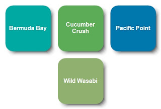
I chose to use the Sitting Here stamp set for my focal image. I stamped the wooden swing on Whisper White card stock using Basic Black Archival ink. I then used the leaves from the Sheltering Tree stamp set to stamp with both Cucumber Crush and then Wild Wasabi (turning the stamp upside down). The image was then die cut using the now retired Circles Collection Framelits.

I used two more circles to cut both a Cucumber Crush and a Pacific Point frame. The edges were inked with Basic Black and then they were layered over the stamped image, adhering them with liquid adhesive.

The pillows were stamped with Basic Black and then colored using Stampin' Write Markers in Pacific Point, Wild Wasabi, Cucumber Crush, and Bermuda Bay. A Basic Black marker was used to ink the edges of the fussy cut pillows. I then used a stylus from my McGill Paper Blossom Tool Kit to "puff up" the pillows like I did for the card in my Just Sitting Here post.

I cut a card base of 5.5 x 11" and then scored it at 2.75" from each end to create a gate fold card. I cut mattes from a piece of Cucumber Crush paper from the 2015-2017 In Color DSP Stack and adhered them to the front panels of the card after first inking the edges with Basic Black.

A Pacific Point 3/8" Stitched Ribbon was adhered to the back of the card and tied in a bow at the left side. Dimensionals were applied to the matted image but the adhesive was only removed from the side opposite the bow. This was done so that the card could be opened and also support the image on both sides.

The sentiment was cobbled together from two stamp sets–Wild About Flowers and Sweet Cupcake. It was stamped on Thick Whisper White using Basic Black. The sentiment was then die cut using a die from the Cupcake Cutout Framelits. A Pacific Point die cut was also made.

The Pacific Point die cut was cut in half, lengthwise, and then offset and glued to each side of the Whisper White die cut. It was adhered to the bottom of the stamped image on the card front.
The pillows were adhered to the stamped swing using doubled up Dimensionals.

For inside the card, a matte was cut from Thick Whisper White. The sentiment was stamped using Pacific Point and the tree was stamped using Soft Suede, Wild Wasabi and Cucumber Crush. The edges of the matte were inked with Wild Wasabi and then it was adhered with Fast Fuse Adhesive to complete the card.

A sheet of In Colors Envelope Paper was also used to create an envelope for the card, using the Envelope Punch Board. The envelope was not photographed.

Linda Vich Creates: Sitting Here Retirement Card. The hanging swing from Sitting Here is the focal image of this lively and bright color schemed retirement card.

Linda Vich Creates: Sitting Here Retirement Card. The hanging swing from Sitting Here is the focal image of this lively and bright color schemed retirement card.

I love the way this card came together and the color scheme really appeals to me! You can save it if you would like to use it for yourself!

Linda Vich Creates: Sitting Here Retirement Card. The hanging swing from Sitting Here is the focal image of this lively and bright color schemed retirement card.


Saturday, July 9, 2016

Brayered Glue Technique For Mass Producing Cards With Detailed Die Cuts

Linda Vich Creates: Brayered Glue Technique For Mass Producing Cards With Detailed Die Cuts.
Have you ever wanted to mass produce a card design that used a detailed die cut? Did you stop short of doing so because of the work involved in adhering the die cuts to the card front? I believe I have found a workable solution!

I am loving the new Flourish Thinlits because they are so lacy looking! However, sometimes all that laciness is hard to work with because if you overlap one die cut with another, it looks a little odd.

To combat this odd look, you can adhere a die cut to a card stock backing and then overlap it with another die cut. Because I needed multiple cards that used the Flourish Thinlits adhered to a background, I tried a gluing technique that worked remarkably well.

I used the Flourish Thinlits to die cut flowers from Melon Mambo card stock and leaves from Cucumber Crush. The bottom two leaves were removed from each leaf die cut. A standard card base was cut from Thick Whisper White card stock, a 5 1/8 x 3 7/8" matte from Whisper White and a 5 1/4 x 4" matte from Basic Black.

I played with the layout of the flower and leaves on the white matte, being sure to leave room for the sentiment. Once I was satisfied with my design, it was time to adhere the Melon Mambo flowers to a Whisper White backing.

For my Brayered Glue Technique, I placed some liquid glue on one side of my craft mat and rolled my brayer through it to completely coat it. I made sure to roll the brayer back and forth a few times to even out the glue and get rid of any blobs.

Linda Vich Creates: Brayered Glue Technique For Mass Producing Cards With Detailed Die Cuts.

Linda Vich Creates: Brayered Glue Technique For Mass Producing Cards With Detailed Die Cuts.

On the opposite side of my craft mat I flipped two flowers upside down. I held them in place just until the brayer had rolled over the edge of them. Once the glue was applied, I carefully placed the flowers on the Whisper White card stock background and smoothed them down with my hand.

Linda Vich Creates: Brayered Glue Technique For Mass Producing Cards With Detailed Die Cuts.

Linda Vich Creates: Brayered Glue Technique For Mass Producing Cards With Detailed Die Cuts.

I repeated this gluing process until all the flowers were glued. Immediately after smoothing down the last flower, I rinsed my mat and my brayer thoroughly under the tap. Unfortunately, because some of the glue dried on the mat while I was gluing additional flowers, I ended up with some sticky residue that would not come totally come off the mat. (I may still be able to scrub the glue off my matte but just in case I can't remove it, I recommend that you use a sheet of wax paper as your working surface.)

While my flowers were drying, I prepared my white matte by adding black splatters to it. I did this by dipping an Aqua Pen, filled with rubbing alcohol, into Basic Black Archival reinker and flicking the pen with my finger. Alcohol was used instead of water so that the drops would dry quicker.

To produce the largest drops, I made sure to squeeze my Aqua Pen until I had a large drop forming at the end and then flicked it. The finest splatter marks were made by using the Tim Holtz Splatter Brush.

To ensure that my matte was dry, I zapped it with my Heat Tool. Choosing a sentiment from the now retired Love You Sew stamp set, I used pieces of washi tape to mask off all but the "thanks" in the sentiment. I inked up the stamp with Basic Black, removed the washi tape and stamped. This matte was then adhered to the black matte with Fast Fuse and then adhered to the card front using Dimensionals.

I fussy cut the flower and then used Dimensionals to attach it to the card front. I used liquid adhesive to adhere the leaves just under the edge of the flower to complete the card.

Linda Vich Creates: Brayered Glue Technique For Mass Producing Cards With Detailed Die Cuts.

I hope you have enjoyed reading about my Brayered Glue Technique! If you use this technique, please let me know how it works for you!


Friday, July 8, 2016

Swirly Bird Wreath

Linda Vich Creates: Swirly Bird Wreath. Swirly Bird wreath card in neutrals, gold, and In Colors.
Have you been playing with the new In Colors? I can't get enough of them! I really like the way that they play so nicely with our other Stampin' Up colors.

Today's card started with neutrals–Basic Black and Very Vanilla–and touches of gold.

I cut a standard card base from Very Vanilla and topped it with a matte of Basic Black on the left side. Using the grunge stamp from the Swirly Birds stamp set, I stamped in Versamark and heat embossed with Gold Stampin' Emboss Powder. I added one more grunge stamp from the Touches of Texture stamp set and heat embossed it as well. To carry the gold theme a little farther, I added a thin strip of Gold Foil Paper down the right side of the Basic Black matte.

Using the Swirly Scribbles Thinlits, I die cut the largest swirly circle from Very Vanilla and adhered it to the card front using liquid adhesive. I then stamped three of the smallest swirls from the Swirly Birds stamp set with Sweet Sugarplum on Very Vanilla. I stamped two of the larger swirls in Mint Macaron and also two leaves in Emerald Envy. The bird was stamped in Rose Red. These were all die cut and then adhered to the card front using Dimensionals.

For the inside of the card, three of the larger swirls were stamped in Sweet Sugarplum and die cut. Two of the smaller leaves were stamped with Emerald Envy inside the card and the swirls adhered over them using Glue Dots.

Linda Vich Creates: Swirly Bird Wreath. Swirly Bird wreath card in neutrals, gold, and In Colors.

Linda Vich Creates: Swirly Bird Wreath. Swirly Bird wreath card in neutrals, gold, and In Colors.

I love how well the colors all worked together to create this simple yet effective card! Feel free to save this color combo if you would like to use it.

Linda Vich Creates: Swirly Bird Wreath. Swirly Bird wreath card in neutrals, gold, and In Colors.


Wednesday, July 6, 2016

Best Birds Thank You

Linda Vich Creates: Best Birds Thank You. Learn how the bird was created to look 3D on this delightful thank you card.
Every once in awhile, the stars align and a crafting session goes as smoothly as spreading peanut butter on a slice of bread. Today was one of those days. :)

As I sat reviewing my new stamp sets, I chose the Best Birds to create a card.

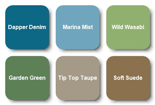
I had a blue bird in mind and chose a scrap of watercolor paper to try out my hunch that Marina Mist and Dapper Denim was the combination I was seeking. I used my Kuretake Fude Water Brush Pen and reinker to paint a few strokes. The blues were perfect together!

Then, since I was also going to be stamping a branch, I tried out Wild Wasabi and Garden Green for the leaves and Tip Top Taupe and Soft Suede for the branch. These combinations also worked well.

I then consulted a downloadable PDF from Patty Bennett that I had saved to Evernote. The PDF is a wonderful resource that provides a sample of all the DSP in the new 2016-2017 catalog. I was looking for a paper that would look good with the bird I was going to paint. One of the new Moroccan papers fit the bill!

I began by stamping, with Basic Black Archival ink, the bird and the branch onto watercolor paper using my MISTI. I zapped the images with my heat tool just to make sure the ink was set and then began watercoloring them using the reinkers I had selected previously. When complete, I heat set the images and then die cut them using the Birds & Blooms Thinlits.

Using the Hello You Thinlits, I die cut three "thanks" from Wild Wasabi and adhered them together using liquid adhesive. I chose green for this sentiment to pick up the green from the leaves and to provide a little relief from all the blue. I inked the stacked die cut with Versamark and then heat embossed with Clear Stampin' Emboss Powder three times to make the sentiment good and shiny.

To create the rest of the sentiment, I stamped with the Labeler Alphabet stamp set onto Thick Whisper White using Dapper Denim ink. To use these letters, you really need to stamp one letter at a time to be able to get them close enough to each other. Once complete, I cut the sentiment up into individual words.

Now that I had the sentiment, the bird and the branch, I took some time to plan out my layout for the card. I tried several different configurations, including both vertical and horizontal. I finally decided on a horizontal orientation.

It was necessary to create a 5 x 7" card to hold my layout. I first chose to matte the DSP with Dapper Denim card stock, after inking the edges of the DSP with Soft Suede. I then cut a Soft Suede card base to pick up the color of the branch. The matted DSP was adhered to the card front using Dimensionals.

In my post, Just Sitting Here, I used a technique learned from Lydia over at Understand Blue. The technique involves using a stylus, or in my case I used my McGill Paper Blossom Tool Kit, to push out the back of a die cut to give it a realistic 3D look. I wanted to apply this technique to my bird so it would not look so flat. I also used this technique on the branch to a lesser degree.

After puffing up my bird and branch, I attached double Dimensionals to the bird to maintain the "puffiness" and adhered both die cuts to the card front. This then allowed me to lay out and then adhere both parts of my sentiment. I attached the "thanks" with liquid glue. Before adhering the individual words, I used a sponge dauber to ink the edges of each word with Soft Suede. The words were then adhered to the card front using rolled up Glue Dots to provide a little height.

For the inside of the card, a matte was cut from watercolor paper. Leaves from the Birthday Blossoms stamp set were stamped in two corners using Basic Black Archival ink. Once dry, I used Wild Wasabi and Garden Green to watercolor the leaves. The matte was adhered with Fast Fuse to complete the card.

Linda Vich Creates: Best Birds Thank You. Learn how the bird was created to look 3D on this delightful thank you card.

Linda Vich Creates: Best Birds Thank You. Learn how the bird was created to look 3D on this delightful thank you card.

Here are a couple of shots showing the dimension on the card. It looks even better in real life!

Linda Vich Creates: Best Birds Thank You. Learn how the bird was created to look 3D on this delightful thank you card.

Linda Vich Creates: Best Birds Thank You. Learn how the bird was created to look 3D on this delightful thank you card.

I had a lot of fun creating this card! I really like the color scheme–feel free to save it!

Linda Vich Creates: Best Birds Thank You. Learn how the bird was created to look 3D on this delightful thank you card.


What was really nice was having the ability to create my own sentiment using alphabet stamps. Sometimes the sentiments in a stamp set just don't say what you need them to say so you have to get creative!

I hope you've enjoyed my card today!


Sunday, July 3, 2016

Hearth & Home With Flourish Thinlits

Linda Vich Creates: Hearth & Home With Flourish Thinlits. Brick wall backdrop for this window scene, complete with curtains and window box.
Today I am revisiting the brick wall that I created in my Pop of Paradise For My Daughter post from the other day.

If you remember, the first brick background I created for my card was in the wrong orientation! Today I make use of that background for a horizontal oriented card.
I chose to add a window to my brick wall background to create a somewhat realistic scene for my card.

The Hearth & Home Thinlits were used to die cut three windows from Basic Black and three window boxes from Melon Mambo card stock. I used liquid glue to stack these, one upon the other, for added strength. For the window box, I scored a line at the top before gluing on the last die cut to give the box a bit of dimension.

Because I really wanted the window box to "pop", I inked it up with Versamark and heat embossed it with Clear Stampin' Emboss Powder twice to give it a really glassy finish.

To create the drapes for the window, I cut two lengths of the now retired White Jute Ribbon and glued them to the back of the window frame. I added curtain pulls with some of the now retired Melon Mambo 1/8" ribbon.

A small piece of Smoky Slate card stock was cut to act as the inside of the house. It was glued into place on the brick matte and then the window frame was adhered over it using Foam Adhesive Strips. At this point the card front was adhered to a Basic Black card base using Dimensionals.

I used the retired Bird Builder Punch to punch some leaves from Basic Gray card stock. Flowers were punched from Smoky Slate, Whisper White and Melon Mambo using punches from both the Itty Bitty Accents and Itty Bitty Shapes punch packs, unfortunately both retired! The flowers were shaped using my McGill Paper Blossom Tool Kit. Some rhinestones were colored with a Sharpie and then they were inserted into the flowers.

Leaves were adhered onto the bottom of the window frame using liquid glue and then the window box was adhered into place using triple Dimensionals to achieve the proper height to fit over the window frame. The flowers were adhered using the Fine Tip Glue Pen.

The sentiment from the Picture Perfect stamp set was stamped on Melon Mambo with Basic Black Archival Ink and then the sentiment was punched with the now retired Washi Label Punch. The strip was adhered to the card front using Dimensionals.

Smoky Slate and Basic Gray leaves were die cut with the Flourish Thinlits and then adhered to the card front with liquid glue.

A Whisper White matte was stamped with the spray of flowers from the Flourishing Phrases stamp set using Melon Mambo and then the matte was adhered with Fast Fuse Adhesive to complete the card.

Linda Vich Creates: Hearth & Home With Flourish Thinlits. Brick wall backdrop for this window scene, complete with curtains and window box.

Linda Vich Creates: Hearth & Home With Flourish Thinlits. Brick wall backdrop for this window scene, complete with curtains and window box.

I am delighted with how this card turned out! What is really pleasing is that I was able to use both of the brick backgrounds I originally created but in two very different ways!

Have you tried creating an inked and embossed brick background yet? It is really fun and you can use any inks you need to match your project!


Saturday, July 2, 2016

It's A Good Day

Linda Vich Creates: It's A Good Day. The crisp colors of white and navy come together in this stunning card that uses the Floral Boutique DSP.
Last night I was clicking through my Evernote app looking at various card techniques when I spotted the Double Pleated Card technique from Iced Images. Instantly I knew what I was going to do with this technique.

I started by selecting one of the papers from the Floral Boutique DSP and trimming it to 5 x 10". I scored it, on the long side, at 1" and then 1.5" and repeated this pattern of one inch and then a half inch across the sheet.

Turning the sheet over, I marked both at 2 and 3" on each short end and then lined up my sheet at an angle in my Stampin' Trimmer with the 2" mark and the scored mark closest to it on either side of the centre fold in the sheet. Then I lined up at the 3" mark and the scored mark closest to it on the other side of the paper. I repeated this by switching to the other end of the paper. This gave me a diamond-shaped piece of paper.

Turning over to the side of the DSP I wanted to display, I alternated mountain and valley folds until I reached the middle scored section. I then switched to the other end of the paper and repeated this process until my entire sheet was pleated and met in the centre. I used Fast Fuse Adhesive to secure the pleats.

The length of this pleated piece measured 5" and the width was 4" so I cut a matte from Thick Whisper White card stock in this size. Using the Petal Burst Embossing Folder, I dry embossed the matte and then used Fast Fuse to adhere the pleated piece to it. A length of the now retired Night of Navy Seam Binding was adhered across the middle of the pleated piece. This panel was then adhered to a Night of Navy matte using Dimensionals. A Thick Whisper White card base with a finished size of 4.75 x 6" was then used.

I used the Botanical Builders Framelits to die cut a flower from the Thick Whisper White and stamens from Night of Navy card stock. These were shaped with my Mcgill Paper Blossom Tool Kit. The stamens were adhered with liquid glue and the flower adhered to the card front with a Dimensional. A pearl was added to the centre of the flower.

A piece of white Baker's twine tied together a length of pearl trim from the now retired Love Blossoms Embellishment Kit. These were adhered with glue dots. The sentiment from the Best Birds stamp set was stamped on Night of Navy using Versamark and heat embossed with White Stampin' Emboss Powder.

The Layering Circles Framelits were used to die cut the sentiment and then the now retired 1 1/4" Scalloped Circle Punch was used to cut a Thick Whisper White matte. These were adhered to the card front using Dimensionals.

Inside the card I adhered a strip of the same DSP and also stamped some flowers from the Touches of Texture stamp set to complete the card.

Linda Vich Creates: It's A Good Day. The crisp colors of white and navy come together in this stunning card that uses the Floral Boutique DSP.

Linda Vich Creates: It's A Good Day. The crisp colors of white and navy come together in this stunning card that uses the Floral Boutique DSP.

Don't you just love the crisp look of Night of Navy and Whisper White? It makes me think of wash day when clean white sheets could be seen billowing on a clothesline!

Have you used the Floral Boutique DSP yet? These papers are part of the Floral Boutique Suite found in the catalog on pages 76-77. I'm sure you will want to pair them with the matching Washi Tape, Solid Night of Navy Baker's Twine, Detailed Floral Thinlits Dies and Floral Phrases stamp set. I think this is one of the nicest suites in the catalog! Place your order with me today so you can enjoy creating with this wonderful suite!


Friday, July 1, 2016

Pop of Paradise For My Daughter

Linda Vich Creates: Pop of Paradise For My Daughter. An inked and embossed brick matte serves as the backdrop for this stunning Pop of Paradise flamingo card.
I couldn't wait to begin my summer holidays, on Canada Day, by designing a card for my daughter Courtney.

Courtney has just finished her first year of a two year course to become a Licensed Practical Nurse. Her course is actually four years compressed into two and she has been working very hard to maintain her "A" grades which is no small feat considering she and her boyfriend are also raising their own soon to be three-year-old daughter!

For Courtney's final practicum of the year, she was placed in a care home in the south end of Winnipeg. When she learned of her placement, she was a little nervous about accidentally doing something wrong there because the home was for Jewish patients and there were strict rules about not bringing any food or water into the facility unless it was kosher.

She was also worried that she might inadvertently offend a patient by doing procedures, etc. that might conflict with their beliefs.

As it turned out, the staff at the care home were completely impressed with her and could not stop telling her how well she was doing and that they had never had a student like her before!

Just before she finished her practicum, the Director of Care took Courtney aside to tell her how impressed she was with her and offered her a summer job! Unfortunately, Courtney was unable to take it because she had to look after her own daughter during the summer (as well as preparing assignments ahead of starting classes in September so she could then concentrate on studying for tests) while her daughter's daycare provider took holidays.

When Courtney explained this to the Director of Care, she was told to return after she completed her nurse training because they would offer her a job at that time! Of the group of students that did their practicum at the same care home, she was the only one who was offered a job!

We are so very proud of her so I wanted to create a special card for her.

Choosing my Brick Wall Embossing Folder, I inked up the top flap with Melon Mambo using my now retired Brayer. I did this in order to create pink grout lines between the bricks.

I carefully placed a matte of Thick Whisper White card stock on the opposite flap of the folder and closed the folder. I ran it through my Big Shot and then carefully removed the embossed and inked matte to work with it.

Oh oh . . . I'd done it again! I was making a vertical card but needed the bricks in a horizontal format. Unfortunately, I had not placed the matte in the folder correctly. So, what to do? I used this first matte as my test piece for coloring the bricks!

I used Sponge Daubers with Smoky Slate, Basic Gray, Basic Black and Melon Mambo to color the bricks. At the end, I used a Stampin' Sponge to sponge softly around the whole matte with Basic Black. I was quite pleased with how the bricks turned out!

Linda Vich Creates: Pop of Paradise For My Daughter. An inked and embossed brick matte serves as the backdrop for this stunning Pop of Paradise flamingo card.
Love the color I achieved on the bricks but too bad the
bricks were the wrong orientation for my card!
After inking/embossing another matte, I set forth to color bricks again. So what happens this time? I liked the first matte better! Oh well! I'll use the first matte in a future project.

I used my MISTI to stamp the flamingo from the Pop of Paradise stamp set in Melon Mambo on Thick Whisper White card stock. Next, I used a tip learned from fellow demonstrator, Bibi Cameron in a video on her site. I cleaned the stamp without moving it and then took a Rose Red Stampin' Write Marker and added color to the stamp on the wing, neck, body, and legs to provide shadowing.

I also used the Basic Black marker to color the end of the flamingo's beak to make it look like a real flamingo. The MISTI ensured that I was able to stamp successfully in the exact same place each time.

Linda Vich Creates: Pop of Paradise For My Daughter. An inked and embossed brick matte serves as the backdrop for this stunning Pop of Paradise flamingo card.

I then used Versamark to stamp three leaves and heat embossed them using Silver Stampin' Emboss Powder. And then came the fun part–fussy cutting the flamingo and leaves. Not so fun but effective! I applied liquid glue to the bottom of the leaves and adhered them to the matte.

The Layering Circles Framelits were used to cut a Melon Mambo scalloped matte and a plain circular matte from Silver Glimmer Paper. These were glued together with liquid glue.

Thick Melon Mambo Baker's Twine was wrapped around the matte and taped to the back. Glue dots were used to adhere a circular arrangement made from the now retired Silver Cording Trim. The circle mattes were adhered on top of this using Dimensionals and the flamingo adhered on top, also with Dimensionals.

The sentiment from the Crazy About You stamp set was stamped in Versamark on Basic Black card stock and heat embossed with White Stampin' Emboss Powder. The ends of the strip were flagged using the Banner Triple Punch. The strip was attached to the bottom of the matte with Dimensionals.
The finished brick matte was adhered with Dimensionals to a Melon Mambo matte, and then that to the front of a Basic Black card base.

I stamped with Melon Mambo on a Whisper White matte using the grunge stamp from the Touches of Texture stamp set. The sentiment was stamped with Basic Black to complete the card.

Linda Vich Creates: Pop of Paradise For My Daughter. An inked and embossed brick matte serves as the backdrop for this stunning Pop of Paradise flamingo card.

Linda Vich Creates: Pop of Paradise For My Daughter. An inked and embossed brick matte serves as the backdrop for this stunning Pop of Paradise flamingo card.

Linda Vich Creates: Pop of Paradise For My Daughter. An inked and embossed brick matte serves as the backdrop for this stunning Pop of Paradise flamingo card.

I am so very pleased with how this card turned out and can't wait to give it to my daughter!